Launching a new product marketing website to help neurodiverse users achieve their mental health goals
■ Overview


Design Challenge
COG ADHD is on a mission to revolutionise ADHD care through its digitalisation. It is the all-inclusive ADHD toolkit, connecting ADHDers with therapists, self-help, and symptom-tracking tools.
Over two months, I redesigned and relaunched their product marketing website. As Product Design Lead, I worked closely with their team from start to finish to evaluate their core needs and propose both a scalable design system and a feasible technical solution. The website will be used both by ADHD users as well as business representatives who are interested in offering neurodiversity support for their workforce.
Lorem ipsum

The problem
Non-ADHD Friendly - COG is looking for ways to elevate its existing website to ensure it resonates more meaningfully with its end-users.
Low conversion rate - Engagement with the professional therapy services on the platform is low. This is one of the platform’s core features and primary source of revenue. Why are users hesitating to commit to therapy with COG? In what ways can we enable more holistic support on their journey with self-care?
Business as usual - The platform is undergoing a deep narrative shift. COG is pivoting to include a B2B service. As they move towards a more corporate-appealing stance, it is important to the founders that their roots of being “people-first” are still front and centre.
The solutions
I designed a visual-first website to make content more accessible to ADHDers, featuring unique illustrations, vibrant colours, digestible copy and an engaging tone.
The product is now presented as a “complete toolkit” to support the therapy experience. Therapy is no longer an afterthought but the core message of the service. I helped to define, brand and market new ADHD therapy programs, namely an A-Z Program and a Pay As You Go scheme.
Maintaining consistency with the rebrand, a For Business section was added to the website. A form allows for easy reach-outs.Launching a B2B section, a Careers page, an About Us page, etc.
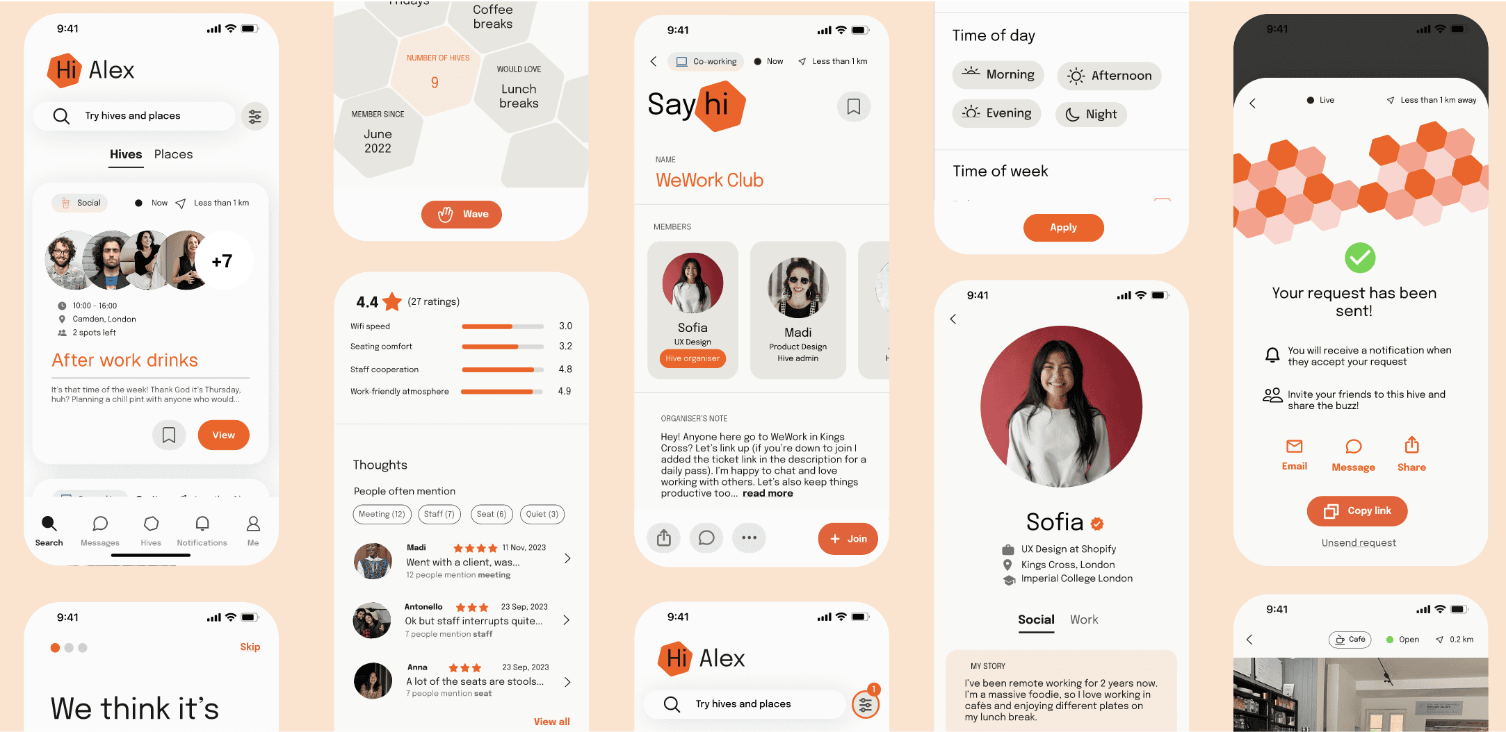
ONBOARDING
Learn
Creating an informative onboarding process that is appealing by using a clean, minimalist and professional layout
Devising friendly copy to highlight key benefits
Providing users with a sense of control about viewing more details or getting started with their journey
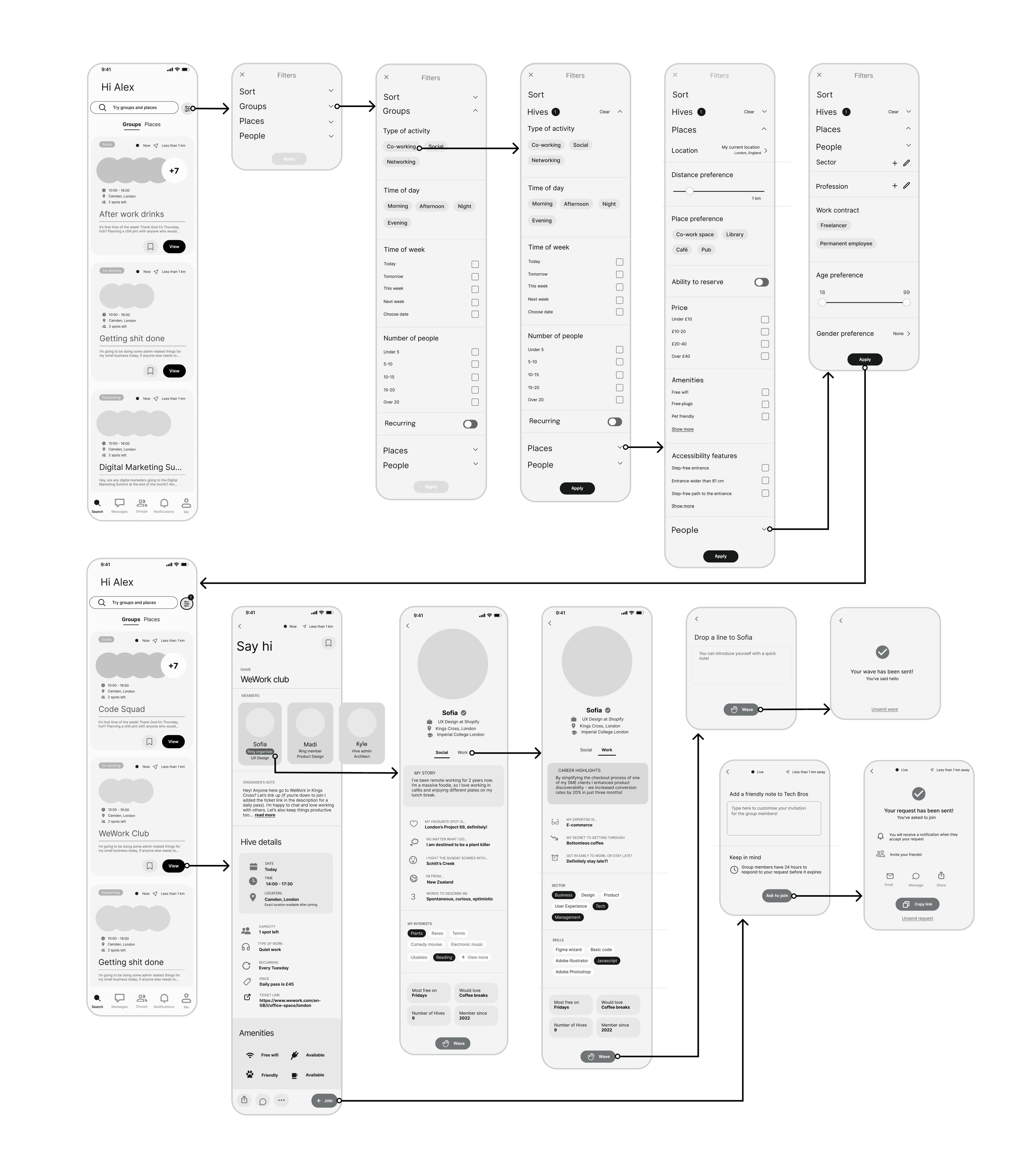
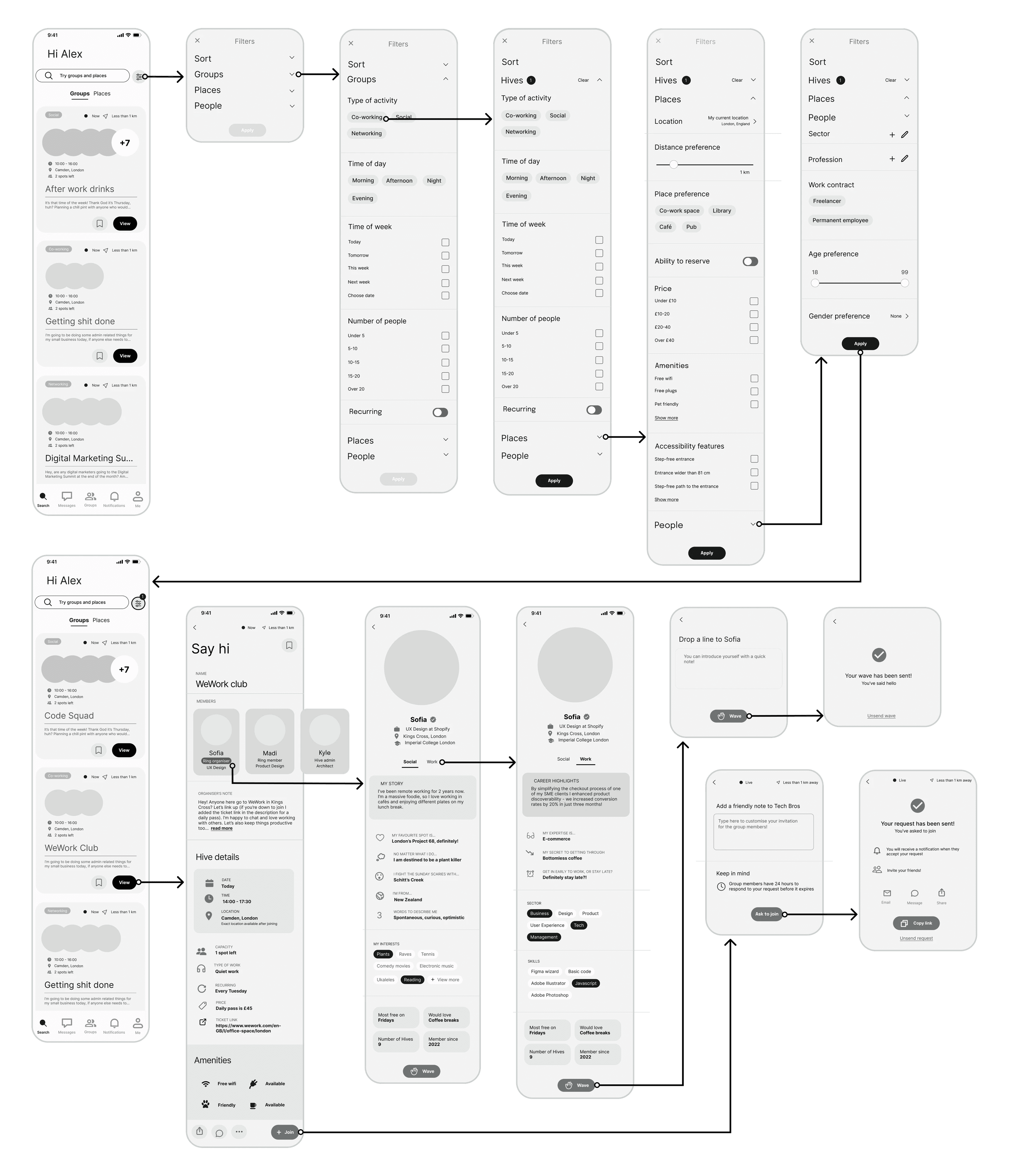
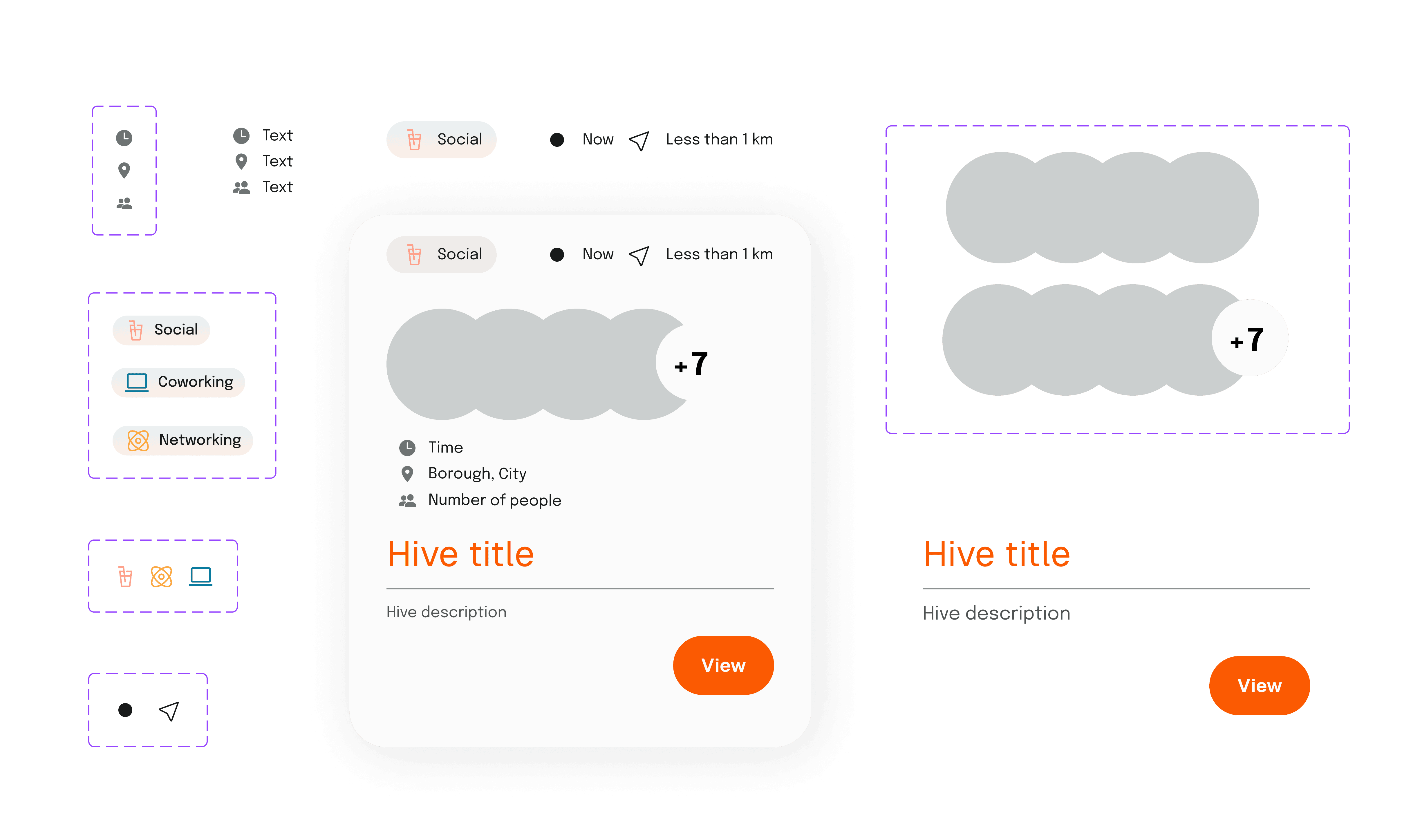
FILTER AND SEARCH
Discover
Tags on event pages have helpful iconography, reducing cognitive load and enabling users to scan content quickly when browsing during work hours
Comprehensive filtering allows users to find others and partake in the most ideal activity based on their needs (e.g. time, place, accessibility, amount of people, etc.)
A search system allows for direct access to groups and places
To step into the minds of an ADHD user, I explored secondary research and literature on the topic. I also did a deep-dive into statistics around mental health and seeking support through the lens of ADHD.
To deepen my understanding of the state of mind of ADHD users seeking support, I interviewed 4 ADHDers and 1 ADHD clinician. I also interviewed Co-Founder, Caroline Jaworsky. Combined, this data was analysed and used to uncover the most pressing issues impacting the success of the existing marketing website.
89%
of adults with ADHD reported challenges with self-care activities, from household routines to self-organization
 Forbes (2023)

Insights
Designing for a distractable audience
Procrastinators who therefore have a hard time prioritising self-care
ADHD users feel that therapy is scary can feel like a "big leap"
Opportunities
Find creative ways to keep the users engaged
Make the product memorable and help it to stand out — if they leave, they'll be more likely to remember COG, come back and convert
Make the "leap" feel easier — reduce the "ivory tower" reputation of therapy and make it more relatable and approachable
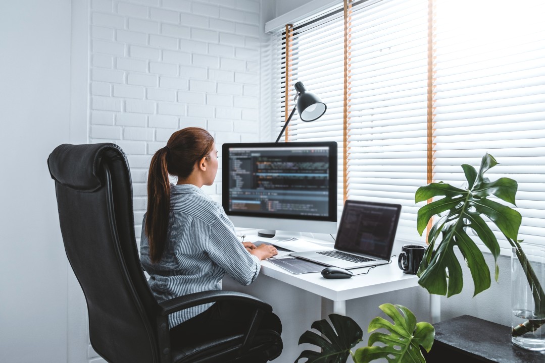
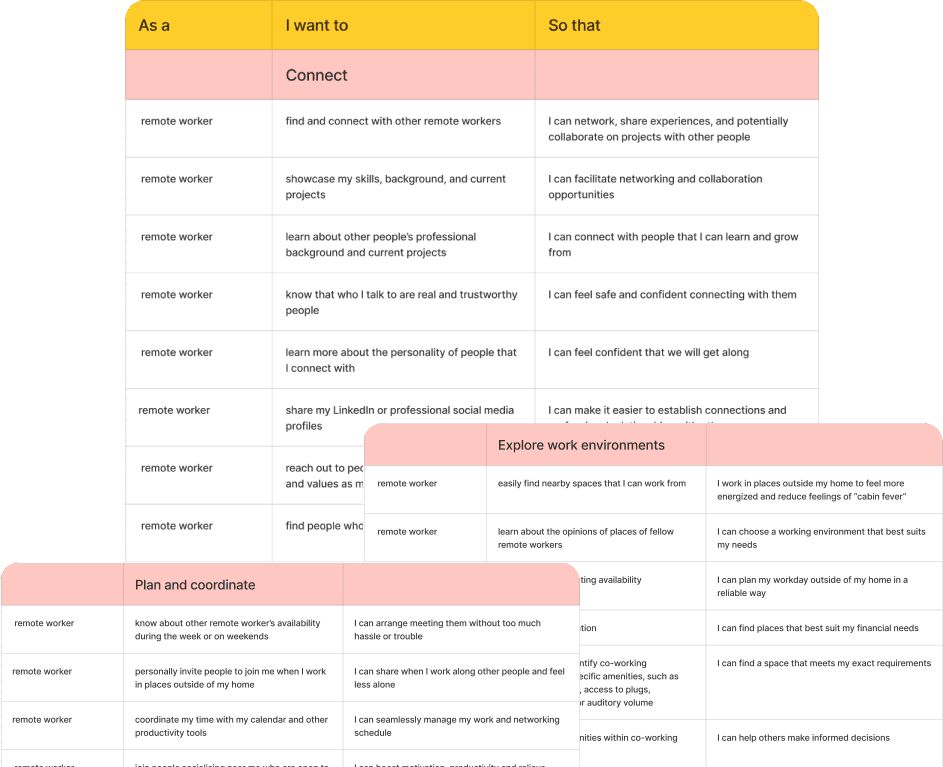
Alex has embraced the remote work lifestyle for the past three years. They value both their international co-workers and their local community, but sometimes feel disconnected from both due to the unique challenges of remote work. They have a strong desire to balance their professional life with more meaningful social interactions in their day-to-day, as remote working can feel lonely quite often. Living in a vibrant urban neighborhood, Alex frequents local cafes and libraries as their workspace once a week as a way to counter their feelings of isolation. They have also tried out a few co-working spaces but find the price is not sustainable and have a hard time meeting and connecting with people who have similar interests to them. They are looking for company during their working hours, to be shared with people who have common interests to them.
FRUSTRATIONS
Feels isolated working from home
Finds her workday monotonous and repetitive
MOTIVATIONS
Meet new people in her local community
Socialise or work alongside people in her day-to-day to stimulate herself personally and professionally
BEHAVIOURS
Tries out different co-working spaces, libraries and cafès in search of the right fit, hoping to discover places to work comfortably while connecting with others
Occasionally works alongside friends, but finds it hard to coordinate a time and place that’s convenient for all parties
Co-working spaces
As confirmed with user interviews, in person co-working spaces provide missed opportunities for connection as they do not facilitate or provide opportunity for meaningful interaction.

Virtual meet-up apps
Virtual meet-up apps for remote workers don’t tackle physical loneliness.
Physical meet-up apps
The remote-working community gets heavily diluted in the app and event apps don’t provide the tailored information required by a remote worker to work comfortably alongside other people.


Developing the unique concept of a meet-up app designed within a work capacity, relatively personal information will be conveyed through the app. This may include not only the sharing of a user’s live location with potential strangers but also content that can imply personal wealth and financial status. For this reason, safety should be heavily prioritised.
It is important to strike a balance between professionalism and friendliness. I aim to prevent users from feeling intimidated or feeling any notion of imposter syndrome by developing a welcoming design that can help them to feel comfortable reaching out to each other.
It is important to reduce cognitive load as much as possible. This is because despite wanting to find opportunities to meet with others, people experiencing loneliness might fall into the trap of making excuses to stay at home and in their “comfort zone” if there are too many steps or if the process to meet up is too complicated.

Develop

I started this process by brainstorming with thinking/exploratory sketches and exercises like Crazy Eights. I made sure to refer back to Alex and the Design Principles I had laid out every time an idea for a concept was sparked.
While checking out direct competitors on Mobbin and the Apple App Store, it was useful to take note of their UX/UI for inspiration. I also took care to explore beyond direct competitors for added edge and perspective (e.g. dating apps, which have been designed to foster connection). I then grouped key features or elements and annotated them, creating an inspiration board in Figma.
For example, during the sketching process of possible layout options for events/activities, it became clear just how integral the clear representation of people is to the transmission of a sense of community. I chose to place people at the forefront of my design and opted for profile icons instead of image banners for the activities themselves.


Version 1
19 usability issues, 14 solutions prioritized for improvement of the prototype.
Version 2
12 usability issues, 11 solutions prioritized for improvement of the prototype.
Version 3
Complete and ready for next round of testing.


Warmth
Connection
Focus
Friendly
Growth

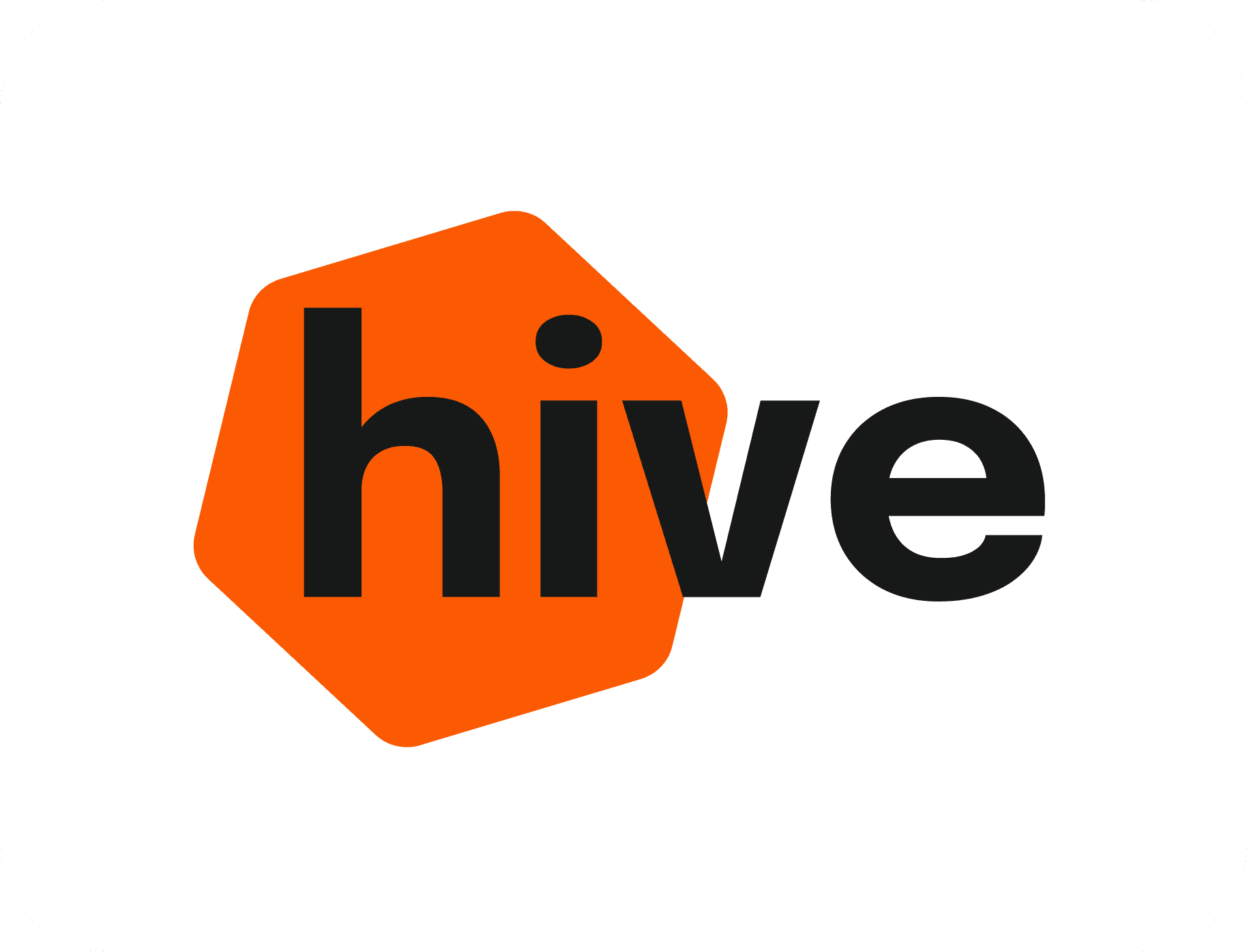
Name selection
Exploring various concepts that could reflect these key words, when coming up with the name, I searched for a word or expression that portrayed the notion of productivity, collaboration and the sharing of space. I settled on the name "Hive" - a place that brings together "worker bees." Although they may work in different fields (no pun intended), worker bees are brought back together to one place at the hive, where they share and contribute to the general growth of the group.
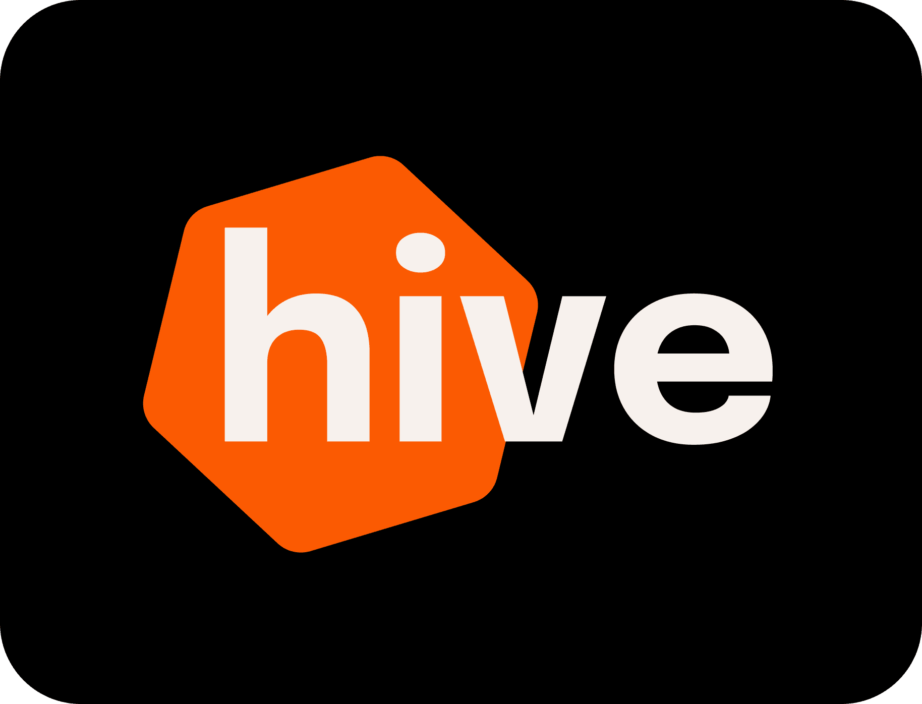
Final logo
Easily recognisable
Geometric shape feels focused
Bold and confident
Left alignment feels dynamic and implies movement
Tilted shape feels playful and friendly
Logo with wordmark
Simple and minimalist
Friendly, bold font
Shape edges are soft and inviting

■ Conclusion
PRESENTING THE PROJECT
Introducing Hive
I had the pleasure of testing informally with dozens of users at a Demo Day in London. The most rewarding moments were connecting with people who had experienced remote work. One gentleman became very emotional looking through the app. He vulnerably shared that he had experienced serious depression brought on by the isolation of working alone, and that Hive would've been what he needed to feel less alone. This served as informal confirmation that the MVP of the design is on the right track.


