Hive

Hive

Hive

Connecting busy bees

Connecting
busy bees

Connecting
busy bees

A social networking app for
remote workers that reimagines
the future of work

Overview

Duration

Sep 2023 - Dec 2023 (10 weeks)

Tools

Figma, Notion, Otter AI, Mobbin

My role

UX Research, Branding, UX/UI

Team

Independent project

Duration

Sep 2023 - Dec 2023

(10 weeks)

Sep 2023 - Dec 2023

(10 weeks)

Tools

Figma, Notion, Invision,

Otter AI, Mobbin

Figma, Notion, Invision,

Otter AI, Mobbin

My role

UX Research, Branding, UX/UI design

UX Research, Branding, UX/UI design

Team

Independent project

Independent project

Design Challenge

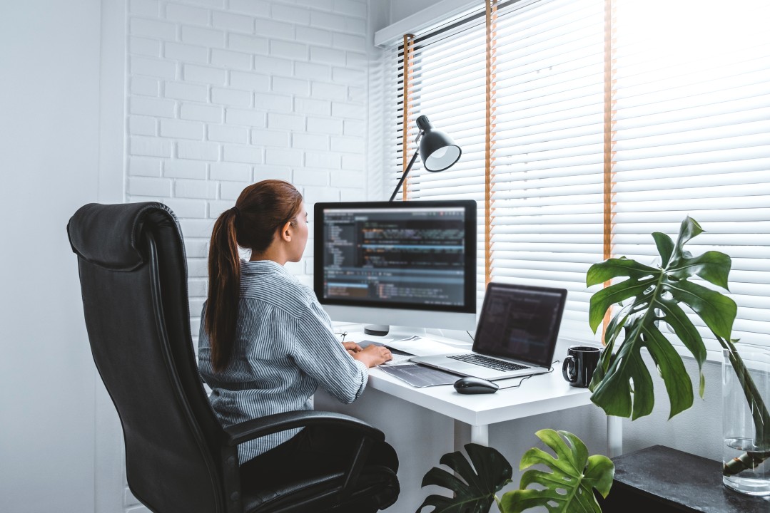
Having worked for over a year in a fully remote job at Shopify, I found myself seriously missing daily social interactions. On the one hand it allowed for a lot freedom, but it could at some moments feel a bit lonely. I found myself thinking - is it just me that feels this way? How are other remote workers feeling? I turned these initial questions into my problem space.

Me working remotely

The problem

With technological advances like cloud sharing, we are seeing an increase in remote working. In the UK, 40% of the workforce have reported to have worked remotely in the past seven days and 16% do not go to the office at all.

That being said, remote workers struggle with a sense of community and belonging, whereby 53% say it is harder to feel connected to their coworkers and communication is siloed. This increases feelings of isolation and limits their networking opportunities to advance their career.

The solutions

Hive is a social networking app for remote workers. With Hive, users can create or join a group of remote workers to co-work, socialise and network in their day-to-day.

They can connect directly with fellow remote workers with whom they share similar interests, skills, and more.

Additionally, the ability to rate and review public spaces allows users to meet up in spots that meet their remote working standards.
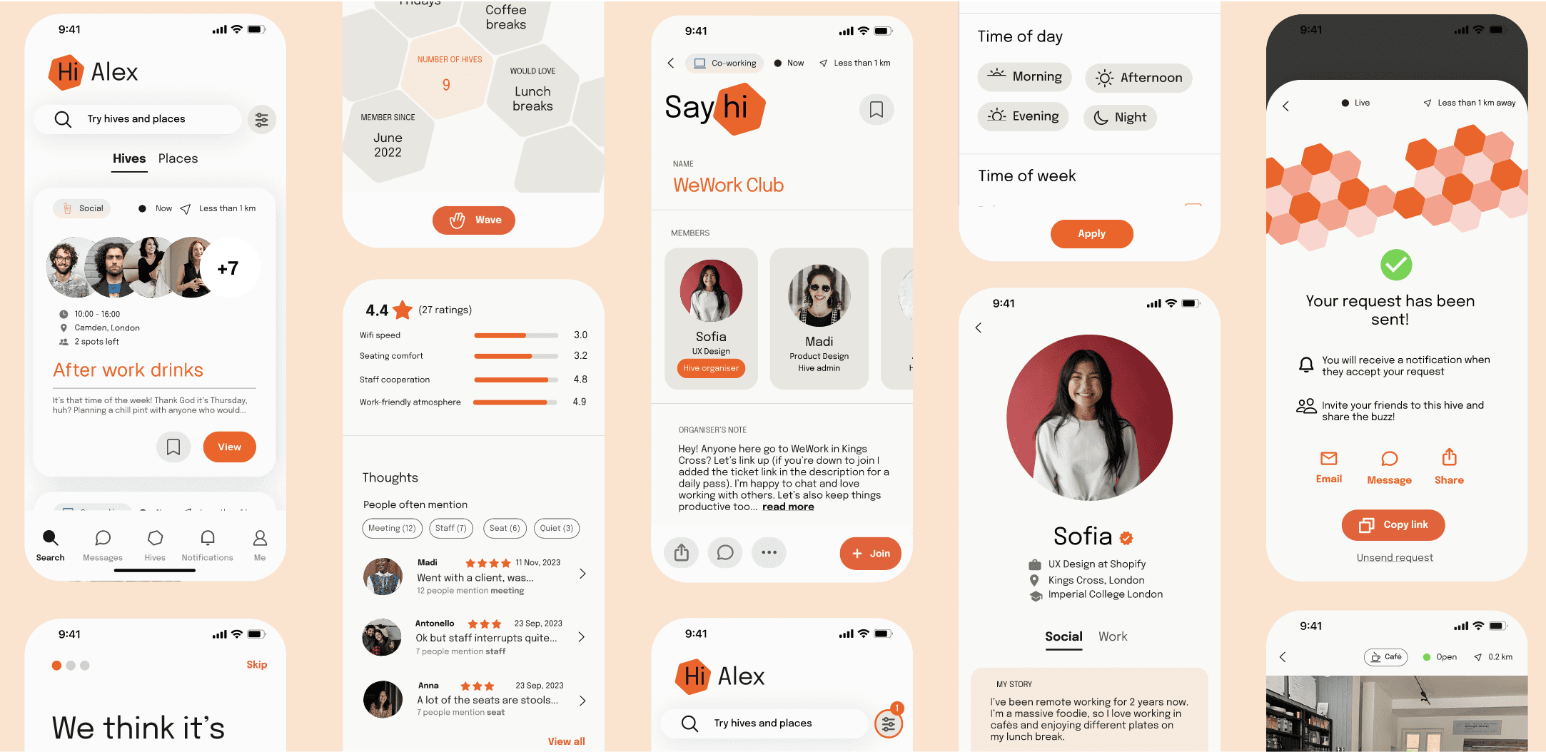
Solutions breakdown


Solutions breakdown

ONBOARDING

Learn

  • Creating an informative onboarding process that is appealing by using a clean, minimalist and professional layout

  • Devising friendly copy to highlight key benefits

  • Providing users with a sense of control about viewing more details or getting started with their journey
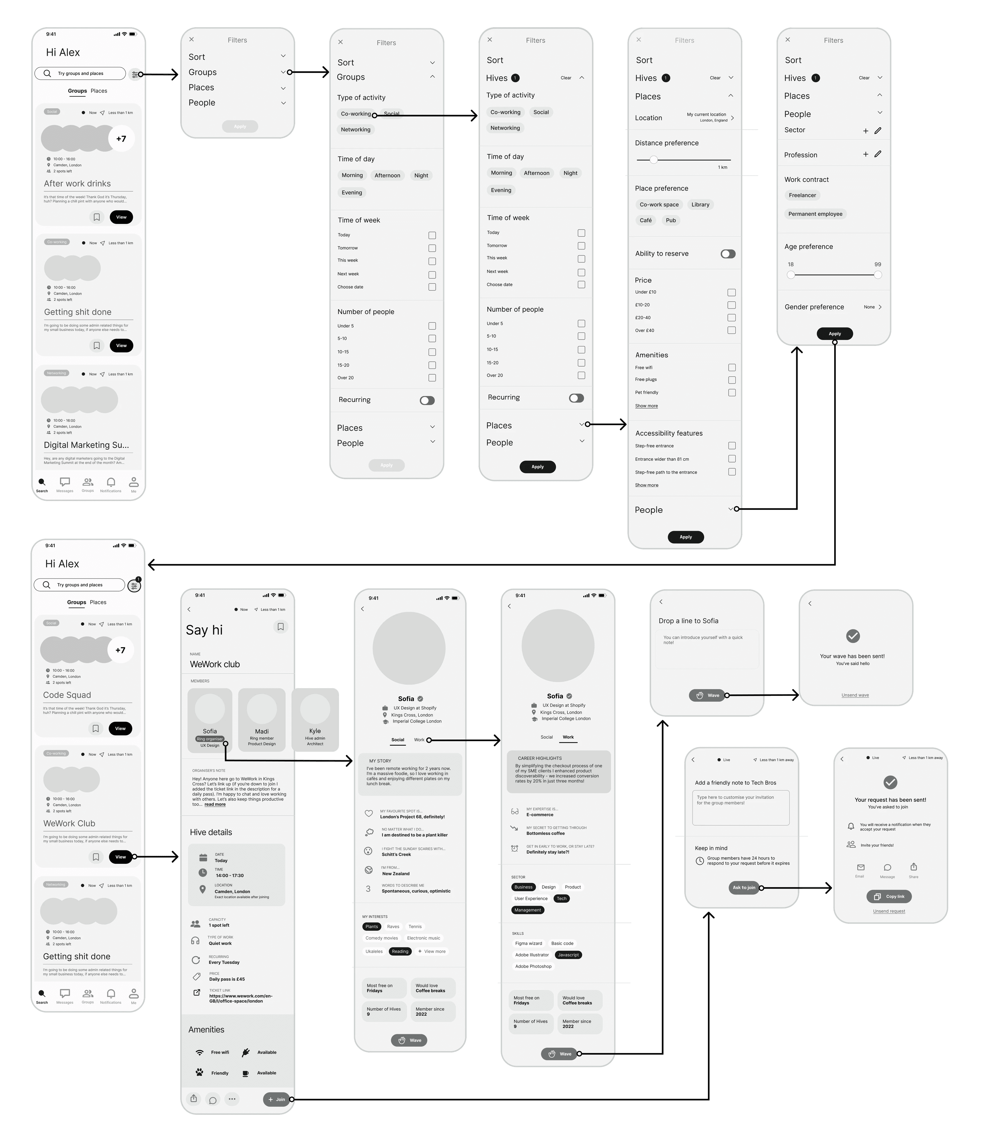
FILTER AND SEARCH

Discover

  • Tags on event pages have helpful iconography, reducing cognitive load and enabling users to scan content quickly when browsing during work hours

  • Comprehensive filtering allows users to find others and partake in the most ideal activity based on their needs (e.g. time, place, accessibility, amount of people, etc.)

  • A search system allows for direct access to groups and places
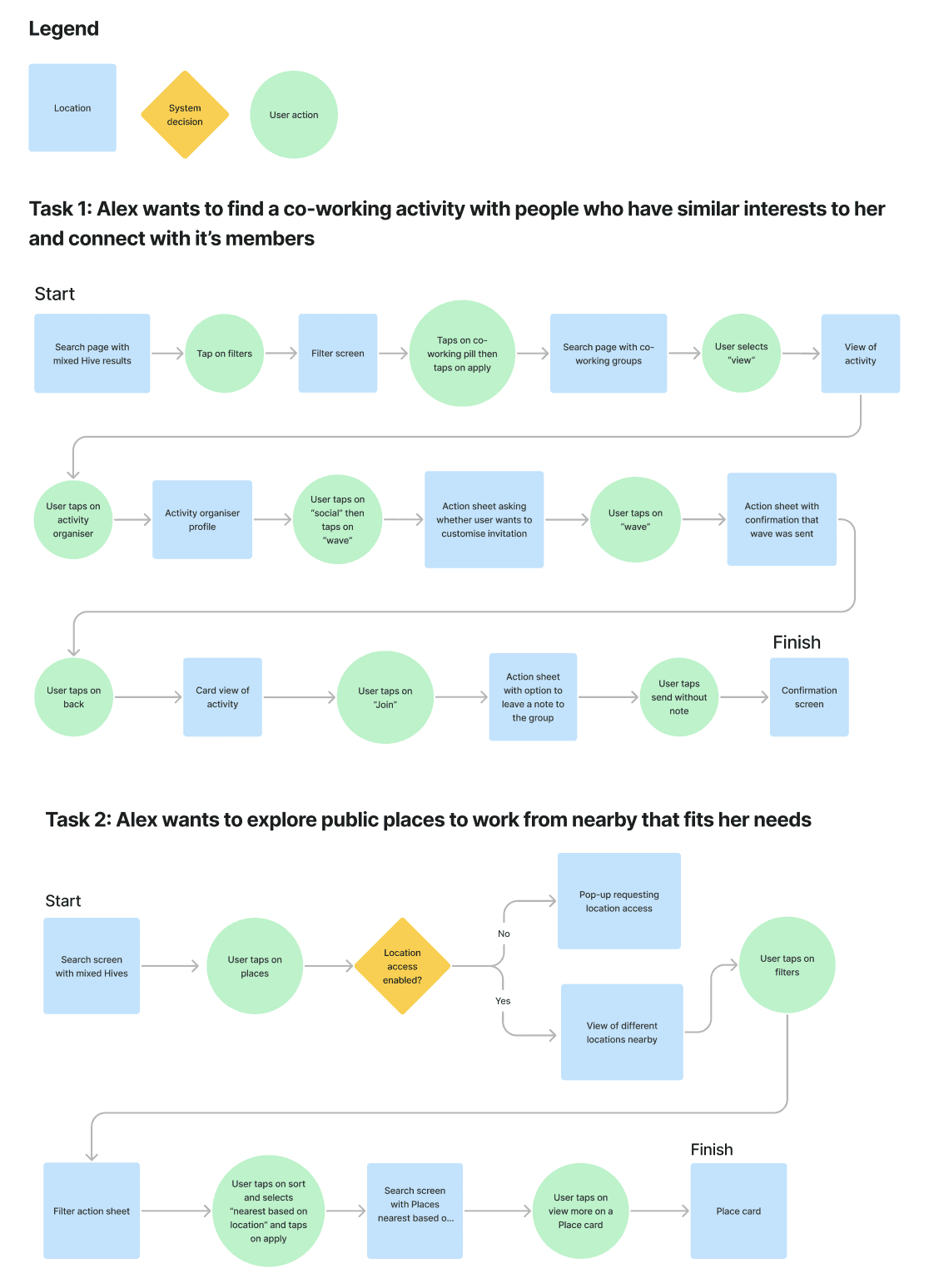
PLAN

Meet up

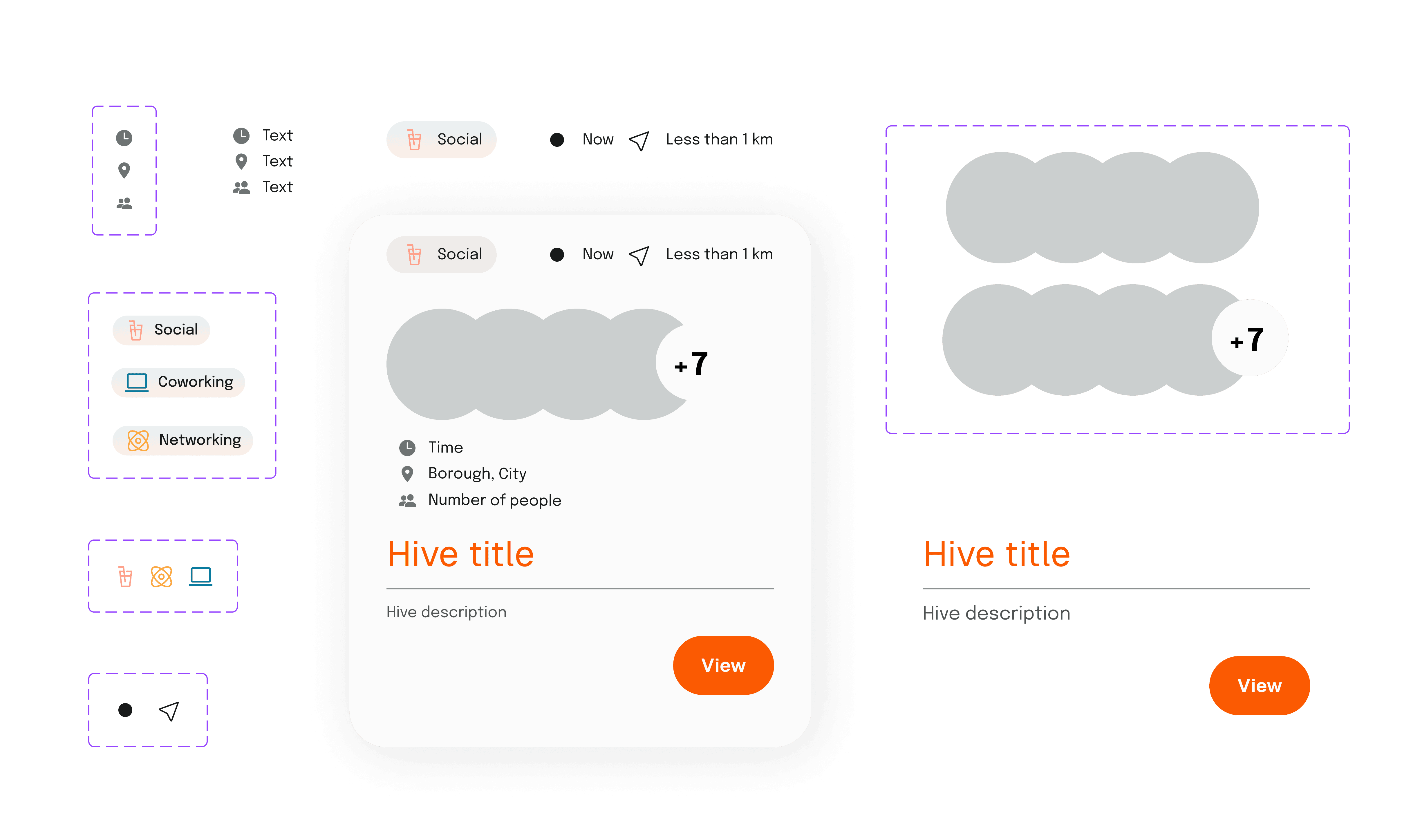
  • Groups (or "hives") showcase a title and description to allow users to quickly understand what to expect and whether it aligns with their interests

  • A list of attendees promotes transparency and encourages engagement, while fostering a sense of community

  • Distance relative to their location allows users to understand and factor in potential travel time in their work day

  • Exact location of a hive is hidden until user is accepted for privacy and safety reasons

  • Amenities available to remote workers allow them to make informed decisions and reduce unpredictability when meeting in unfamiliar public places

SAY HELLO

Find your people

  • Underline tabs split profile into social and career to help counter feelings of potential imposter syndrome

  • Personalisable prompts enable users to express individuality and showcase the human behind the work history

  • Chips with icons allow users to easily scan for common interests, facilitating interactions

  • Vector illustrations give resumé section a friendly and inviting feel

COORDINATE

Location, location, location

  • Underline tabs separate hives from places, allowing users to also conveniently find places to work from outside of the home

  • Community-based reviews are a way to rate the quality of a place from a remote worker perspective, helping users make informed decisions and reduce unpredictability when working remotely outside of the home

  • Map view provides perspective on location and distance

  • Icons enable user to quickly understand the key amenities available in each place

Design process


Design process

Discover

Discover

SECONDARY RESEARCH

Isolation in the era of technology

To begin investigating the problem space, I turned towards existing quantitative and qualitative research. It was important to find sources on the intersection of mental health and remote work from late 2022 onwards, which aren't influenced by the COVID-19 pandemic.

I discovered some shocking statistics related to the future of work and mental health. Contrary to what you might expect, remote work has not gone away since the coronavirus and is expected to rise over the coming years. This confirms that there is a growing need for a solution to this loneliness in the digital age.

USER PERSONA

Isolation in the era of technology

I’d like you to step into the shoes of our target user, Alex, with me. Explore her behaviours, frustrations and goals as she navigates life as a remote worker of three years. From now on, all decisions will be made with her in mind.

The market

16%

of UK companies operate fully remote

+65%

is the expected growth of remote work over the next 5 years

is the expected growth of remote work in next 5 years

The board room

3 in 4

middle market executives reported that their remote workers were feeling isolated

6 in 10

executives say it negatively impacts their employee's mental health

The office

1 in 2

say it is hard to feel connected to their co-workers

1 in 2

feel lonelier at work than before going remote

PRIMARY RESEARCH

Speaking to the bees

To gain a deeper understanding of the problem, and verify the validity of my assumptions at this stage, I conducted 7 user interviews. I chose interviews as my means of primary research because the shadings of loneliness cannot be captured in a checkbox.

Participants

  • Age Above 21 years old

  • Occupation Full-time remote workers

  • Schedule Work at least 30 hours a week

  • Language Native/fluent in English, as interviews will be conducted in English

Take a peek at the questions and interview structure! It was also helpful to crystalise my definition of a "remote worker" at this stage: a freelancer, contractor, or full-time employee that does not have access to a shared in person office space with colleagues.

Interviewing a bee

Affinity Mapping

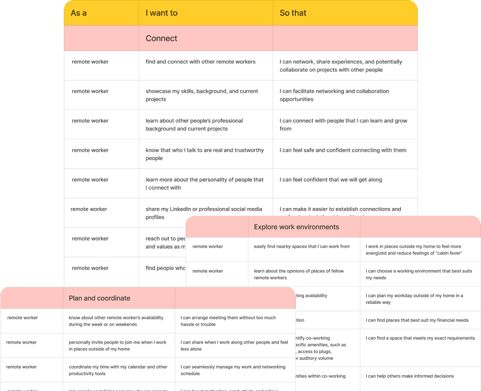
To synthesize and accelerate research analysis with ease, I transcribed recordings using Otter AI and discovered patterns by tagging taxonomies through Notion.

I transferred relevant quotes to Figma and categorised them into three groups: Behaviours, Motivations and Pain points. Find some excerpts below.

Frustrations

Frustrations

Motivations

Motivations

Behaviours

Behaviours

Full-time employees

Full-time employees

3

Contractors

Contractors

2

Freelancers

Freelancers

2

TASK FLOWS

Crafting Alex's journey

KEY RESEARCH FINDINGS AND OPPORTUNITIES

Zooming in on loneliness in the digital age

Physical loneliness & seeking company

6/7 users interviewed mentioned feeling significantly lonely - 2 saying that it was directly impacting their mental health.

Some find it more productive to work alongside others, others find it less productive - but regardless of productivity level, each user interviewed seeks out company and connection by working alongside friends or strangers at least once every two weeks, if not more often.

Finding ways to encourage users to tap into this network of people.

Importance of their local community

Users often do not live in same city as their colleagues. To compensate for this, they lean into their neighbourhood and local area.

They feel connected to people by working from local spots like cafès, libraries, or networking events, with a frequency ranging from a few times a week to at least once a month.

Supporting users to connect with people or places nearby in a productive way.

Lack of meaningful interactions

Users find themselves in environments or situations where they are able to connect with others, but struggle to make deeper connections that go beyond the surface.

They find it hard to break the ice, which hinders their ability to have meaningful interactions within their communities in their day-to-day.

Finding ways to facilitate interactions and assist them in finding people with common interests.

How might we alleviate the physical loneliness experienced by remote workers and foster a sense of connection and belonging in their day-to-day?

Define

USER PERSONA

Say hello to Alex

I’d like you to step into the shoes of our target user, Alex, with me. Explore her behaviours, frustrations and goals as she navigates life as a remote worker of three years. From now on, all decisions will be made with her in mind.

EXPERIENCE MAPPING

What does Alex's day look like?

I decided to visualise what trying to socialise might look like for Alex when she feels lonely at work. Join me in empathising with her by exploring the Journey Map I created here. Her story begins on a day where she feels particularly down. She explores existing solutions for the remote working community, looking for company in her working day. Not interested in virtual solutions, she decides to attend a co-working space. Her negative emotions lift as she enters a space where there is opportunity to connect with others, only to be disappointed and disheartened when she has no luck with that.

USER STORIES AND EPICS

What is Alex missing?

Recognizing the project's confined scope to a minimum viable product (MVP), I prioritised the primary functionality that would offer significant value to Alex.

I did this by creating user stories and organising them into epics. My goal is to find a solution that can facilitate more meaningful interactions with her local community, so as to support her during her workday.

NAME

NAME

Alex Lorna

Alex Lorna

Alex Lorna

PRONOUNS

PRONOUNS

She/her/they/them

She/her/they/them

She/her/they/them

AGE

AGE

28

28

28

PROFESSION

PROFESSION

Software Engineer

Software Engineer

Software Engineer

CITY

CITY

London, UK

London, UK

London, UK

EDUCATION

EDUCATION

Msc, University of Edinburgh

UoE, Msc

Msc, University of Edinburgh

Discover

“It can get a bit lonely working at home sometimes, I'm on the lookout for ways to connect with people in a similar boat as me."

“It can get a bit lonely working at home sometimes, I'm on the lookout for ways to connect with people in a similar boat as me."

“It can get a bit lonely working at home sometimes, I'm on the lookout for ways to connect with people in a similar boat as me."

Alex has embraced the remote work lifestyle for the past three years. They value both their international co-workers and their local community, but sometimes feel disconnected from both due to the unique challenges of remote work. They have a strong desire to balance their professional life with more meaningful social interactions in their day-to-day, as remote working can feel lonely quite often. Living in a vibrant urban neighborhood, Alex frequents local cafes and libraries as their workspace once a week as a way to counter their feelings of isolation. They have also tried out a few co-working spaces but find the price is not sustainable and have a hard time meeting and connecting with people who have similar interests to them. They are looking for company during their working hours, to be shared with people who have common interests to them.

FRUSTRATIONS

  • Feels isolated working from home

  • Finds her workday monotonous and repetitive

MOTIVATIONS

  • Meet new people in her local community

  • Socialise or work alongside people in her day-to-day to stimulate herself personally and professionally

BEHAVIOURS

  • Tries out different co-working spaces, libraries and cafès in search of the right fit, hoping to discover places to work comfortably while connecting with others

  • Occasionally works alongside friends, but finds it hard to coordinate a time and place that’s convenient for all parties

COMPETITOR ANALYSIS

What options does Alex have?

At this stage, it was helpful to explore existing solutions, trying to see them through Alex's eyes. I took care to understand what similar products or services address this problem space and where there might be gaps or opportunities for improvement.

Of all three direct competitor groups, the largest opportunity for a digital solution aimed at alleviating the physical loneliness experienced by remote workers lay within the physical meet-up apps. At this stage I began to brainstorm different ways in which a meet-up app of this genre could be tailored more closely to remote-working communities and their unique needs.

EXPERIENCE MAPPING

What does Alex's day look like?

I decided to visualise what trying to socialise might look like for Alex when she feels lonely at work. Join me in empathising with her by exploring the Journey Map I created here. Her story begins on a day where she feels particularly down. She explores existing solutions for the remote working community, looking for company in her working day. Not interested in virtual solutions, she decides to attend a co-working space. Her negative emotions lift as she enters a space where there is opportunity to connect with others, only to be disappointed and disheartened when she has no luck with that.

BRAND DEVELOPMENT

Breathing life into the digital solution

I selected five key words with my user persona’s goals and frustrations in mind. These strike a balance between friendliness and professionalism - ideal for a social networking app for remote working professionals struggling with isolation who seek connection and company. I then used these keywords to devise a mood board, exploring different textures, typography, shapes, and UI in other apps with a similar look and feel.

DESIGN PRINCIPLES

Laying the foundations for Alex

I established that in order for this digital solution to be successful, it needs have certain guiding principles. These principles represent the value of the brand and help guide decision-making going forward - they should be referred back to throughout the design process and guide my work as a product designer.

USER STORIES AND EPICS

What is Alex missing?

Recognizing the project's confined scope to a minimum viable product (MVP), I prioritised the primary functionality that would offer significant value to Alex.

I did this by creating user stories and organising them into epics. My goal is to find a solution that can facilitate more meaningful interactions with her local community, so as to support her during her workday.

COMPETITOR ANALYSIS

What options does Alex have?

At this stage, it was helpful to explore existing solutions, trying to see them through Alex's eyes. I took care to understand what similar products or services address this problem space and where there might be gaps or opportunities for improvement.

Of all three direct competitor groups, the largest opportunity for a digital solution aimed at alleviating the physical loneliness experienced by remote workers lay within the physical meet-up apps. At this stage I began to brainstorm different ways in which a meet-up app of this genre could be tailored more closely to remote-working communities and their unique needs.

COMPETITOR ANALYSIS

What options does Alex have?

I established that in order for this digital solution to be successful, it needs have certain guiding principles. These principles represent the value of the brand and help guide decision-making going forward - they should be referred back to throughout the design process and guide my work as a product designer.

DESIGN PRINCIPLES

Laying the foundations for Alex

Co-working spaces

As confirmed with user interviews, in person co-working spaces provide missed opportunities for connection as they do not facilitate or provide opportunity for meaningful interaction.

Virtual meet-up apps

Virtual meet-up apps for remote workers don’t tackle physical loneliness.

Physical meet-up apps

The remote-working community gets heavily diluted in the app and event apps don’t provide the tailored information required by a remote worker to work comfortably alongside other people.

DESIGN PRINCIPLES

Laying the foundations for Alex

I established that in order for this digital solution to be successful, it needs have certain guiding principles. These principles represent the value of the brand and help guide decision-making going forward - they should be referred back to throughout the design process and guide my work as a product designer.

  1. Safety


1.

Safety

Safety

Developing the unique concept of a meet-up app designed within a work capacity, relatively personal information will be conveyed through the app. This may include not only the sharing of a user’s live location with potential strangers but also content that can imply personal wealth and financial status. For this reason, safety should be heavily prioritised.

  1. Approachability

2.

2.

Approachability

Approachability

It is important to strike a balance between professionalism and friendliness. I aim to prevent users from feeling intimidated or feeling any notion of imposter syndrome by developing a welcoming design that can help them to feel comfortable reaching out to each other.

  1. Simplicity


3.

Simplicity

Simplicity

It is important to reduce cognitive load as much as possible. This is because despite wanting to find opportunities to meet with others, people experiencing loneliness might fall into the trap of making excuses to stay at home and in their “comfort zone” if there are too many steps or if the process to meet up is too complicated.

Develop

I began to define the overall content structure of the app along with the relationships between different screens and features. I imagined that Alex had already signed up to the app and created a profile, as well as given all the necessary permissions.

TASK FLOWS

Crafting Alex's journey

The prototype underwent two rounds of usability tests. During this time, the task flow was iterated heavily and advanced based on user feedback. The final version of the MVP combined the first and second task flows into a single goal. Check out a comparison between the original task flow and the more updated one. You'll notice that a lot changed - let's break down the process and modifications that followed.

TASK FLOWS

Crafting Alex's journey

EXPLORATORY SKETCHES

Putting the plan into action

Deliver

I began to define the overall content structure of the app along with the relationships between different screens and features. I imagined that Alex had already signed up to the app and created a profile, as well as given all the necessary permissions.

The prototype underwent two rounds of usability tests. During this time, the task flow was iterated heavily and advanced based on user feedback. The final version of the MVP combined the first and second task flows into a single goal. Check out a comparison between the original task flow and the more updated one. You'll notice that a lot changed - let's break down the process and modifications that followed.

EXPLORATORY SKETCHES

Putting the plan into action

USABILITY TESTING

Finalising Alex's path

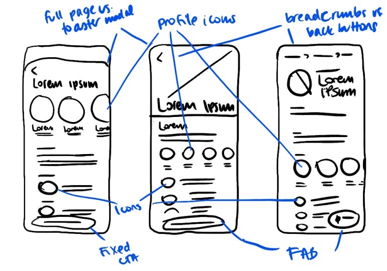
I started this process by brainstorming with thinking/exploratory sketches and exercises like Crazy Eights. I made sure to refer back to Alex and the Design Principles I had laid out every time an idea for a concept was sparked.

While checking out direct competitors on Mobbin and the Apple App Store, it was useful to take note of their UX/UI for inspiration. I also took care to explore beyond direct competitors for added edge and perspective (e.g. dating apps, which have been designed to foster connection). I then grouped key features or elements and annotated them, creating an inspiration board in Figma.

For example, during the sketching process of possible layout options for events/activities, it became clear just how integral the clear representation of people is to the transmission of a sense of community. I chose to place people at the forefront of my design and opted for profile icons instead of image banners for the activities themselves.

EXPLORATORY SKETCHES

Putting the plan into action

USABILITY TESTING

Finalising Alex's path

EXAMPLE WIREFLOW (FLOW 1)

Connecting the dots

Version 1

19 usability issues, 14 solutions prioritized for improvement of the prototype.

Version 2

12 usability issues, 11 solutions prioritized for improvement of the prototype.

Version 3

Complete and ready for next round of testing.
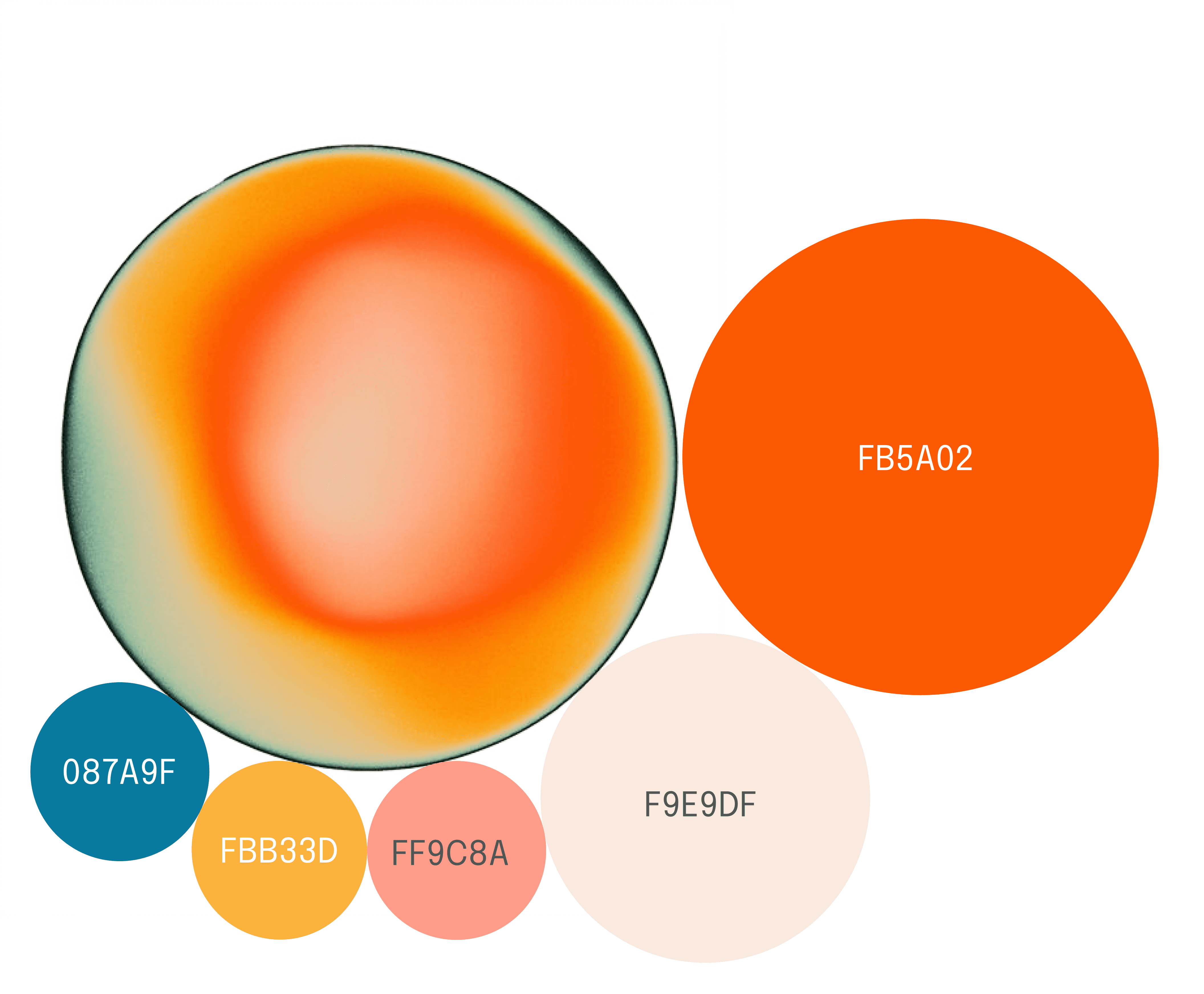
WHAT DOES ALEX WANT TO SEE FIRST?

The evolution of the home screen

The initial concept for the app was to allow users to find live co-working groups nearby. However, during usability testing, users mentioned that they expected to find ways to meet up more informally with fellow remote workers, too. This led to the evolution of card views that listed different types of meet-ups in Version 2, and finally, for added ease and convenient filtering, event-specific tags in Version 3 (see examples below).

Multiple users throughout the testing process expressed that they would like to be able to find a view of suggested events immediately upon opening the app. For this reason, the Version 2 developed the possibility of a more elaborate list view. In order to reduce cognitive load for Alex even further, Version 3 ultimately eradicated the Home Screen, entirely replacing it with Search (see below).

Users also mentioned that live events would be tricky for remote workers to navigate, especially if there is a timeframe for which one may have to wait in order to be approved into a co-working group. Limiting the solution to live events also doesn't take into account travel time — remote workers need to be able to plan further ahead. For this reason, events were redesigned to be available for scheduling in Version 2.

WHAT DOES ALEX WANT TO SEE FIRST?

From a map view of homes to a home for detailed filters

I experimented with map view to demonstrate to Alex that she shares proximity to others and that the bridge to close this physical gap isn't as big as it feels. In tandem with map view, I explored various filtering options to help users customize their search for nearby remote workers with whom they may click with.

Users also mentioned that live events would be tricky for remote workers to navigate, especially if there is a timeframe for which one may have to wait in order to be approved into a co-working group. Limiting the solution to live events also doesn't take into account travel time — remote workers need to be able to plan further ahead. For this reason, events were redesigned to be available for scheduling in Version 2.

UNDERSTANDING ALEX'S PRIORITIES

From a map view of homes to a home for detailed filters

I experimented with map view to demonstrate to Alex that she shares proximity to others and that the bridge to close this physical gap isn't as big as it feels. In tandem with map view, I explored various filtering options to help users customize their search for nearby remote workers with whom they may click with.

Version 1 of user testing indicated that while users were excited to be able to find fellow remote workers near them, they were concerned about user safety. They were apprehensive about sharing their home location to strangers, even if approximated. For this reason, the map view for finding fellow remote users living nearby was removed in Version 2. In both Version 2 and 3, more detailed filters were developed that enable users to find the right people for live meet-ups instead. This ensures Alex meets with people in both a safe and meaningful way.

BACK TO BASICS

Ambiguous doesn't mean safe

Integral to community is the notion of trust and safety - I designed the initial version so that the exact location of an activity is not available until one is accepted to the activity itself by the group members. While this is not uncommon for meet-up apps, stopping here is not sufficient to the realities of a remote worker.

As primary research highlighted, the specifics of a location are vital for remote workers to know whether or not they are able to work comfortably from outside of the home. They need to have access to additional key information (e.g. a sense of the atmosphere, availability of free wifi, etc.).

I initially designed a solution that masked the exact location of an activity while still communicating these essential details, dubbing this the "Undisclosed location" card. While "anonymous," it showed the basics of the location, as well as other user's comments and feedback about the place, too, to give extra context to Alex. It was also really cool, because it switched the UI to dark mode.

During the first round of interviews, however, a user pointed out that this was not safe enough - if someone really tried to, they could use the information unique to a place (like comments or reviews) to identify the location of the meet-up through the Places section of the app, where comments and reviews are visible in accordance to the name of the place.

As such, Version 2 only provided the basic details. The layout, however, was still confusing to users, and in almost all cases was completely overlooked. In a dropdown box on the meet-up screen, it was named "Remote working info." To some users, they looked like options that could be selected, rather than being descriptive. The final version of the wireframes were designed so that only key information relating to the location was visible, labelled "Amenities."

WHAT DOES ALEX WANT TO SEE FIRST?

Ambiguous doesn't mean safe

Integral to community is the notion of trust and safety - I designed the initial version so that the exact location of an activity is not available until one is accepted to the activity itself by the group members. While this is not uncommon for meet-up apps, stopping here is not sufficient to the realities of a remote worker.

As primary research highlighted, the specifics of a location are vital for remote workers to know whether or not they are able to work comfortably from outside of the home. They need to have access to additional key information (e.g. a sense of the atmosphere, availability of free wifi, etc.).

I initially designed a solution that masked the exact location of an activity while still communicating these essential details, dubbing this the "Undisclosed location" card. While "anonymous," it showed the basics of the location, as well as other user's comments and feedback about the place, too, to give extra context to Alex. It was also really cool, because it switched the UI to dark mode.

During the first round of interviews, however, a user pointed out that this was not safe enough - if someone really tried to, they could use the information unique to a place (like comments or reviews) to identify the location of the meet-up through the Places section of the app, where comments and reviews are visible in accordance to the name of the place.

As such, Version 2 only provided the basic details. The layout, however, was still confusing to users, and in almost all cases was completely overlooked. In a dropdown box on the meet-up screen, it was named "Remote working info." To some users, they looked like options that could be selected, rather than being descriptive. The final version of the wireframes were designed so that only key information relating to the location was visible, labelled "Amenities."

EXAMPLE WIREFLOW (FLOW 1)

Connecting the dots

EXAMPLE WIREFLOW (FLOW 1)

Connecting the dots

Deliver

BRAND DEVELOPMENT

Breathing life into the digital solution

Key words

I selected five key words with my user persona’s goals and frustrations in mind. These strike a balance between friendliness and professionalism - ideal for a social networking app for remote working professionals struggling with isolation who seek connection and company. I then used these keywords to devise a mood board, exploring different textures, typography, shapes, and UI in other apps with a similar look and feel.

COLOURS AND TYPOGRAPHY

The look and feel

Warmth

Connection

Focus

Friendly

Growth

Name selection

Exploring various concepts that could reflect these key words, when coming up with the name, I searched for a word or expression that portrayed the notion of productivity, collaboration and the sharing of space. I settled on the name "Hive" - a place that brings together "worker bees." Although they may work in different fields (no pun intended), worker bees are brought back together to one place at the hive, where they share and contribute to the general growth of the group.

Final logo

Easily recognisable

Geometric shape feels focused

Bold and confident

Left alignment feels dynamic and implies movement

Tilted shape feels playful and friendly
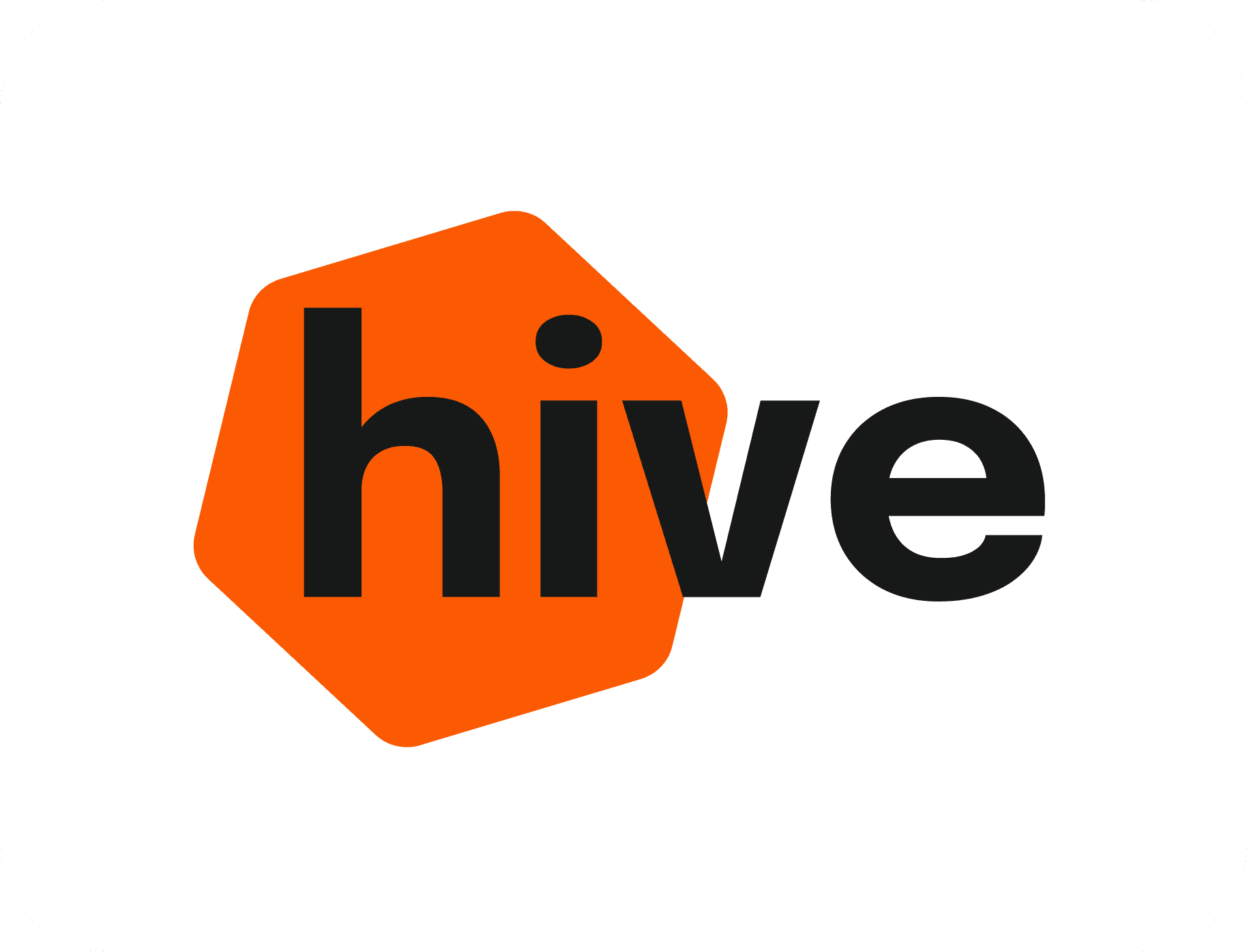
Logo with wordmark

Emphasis on the word "hi"

Emphasis on the word "hi"

Simple and minimalist

Friendly, bold font

Shape edges are soft and inviting

COLOURS AND TYPOGRAPHY

The look and feel

COLOURS AND TYPOGRAPHY

The look and feel

A bold yet inviting shade of orange was selected as the brand colour - vibrant, energetic, and youthful, it ties in neatly with the "hive" concept of the application when looking at real-world examples of hives. The app was built as monochromatic. In the final stages of high-fidelity development, tertiary colours were added to help distinguish the most important tags, namely the event types (co-working, networking or social). This adds a touch of excitement to them and makes them feel more special. Neutrals were also selected to create consistency throughout the application.

A bold yet inviting shade of orange was selected as the brand colour - vibrant, energetic, and youthful, it ties in neatly with the "hive" concept of the application when looking at real-world examples of hives. The app was built as monochromatic. In the final stages of high-fidelity development, tertiary colours were added to help distinguish the most important tags, namely the event types (co-working, networking or social). This adds a touch of excitement to them and makes them feel more special. Neutrals were also selected to create consistency throughout the application.

Font

Epilogue

UX, Branding, UI

Letter spacing

0%

Paragraph spacing

0px

Case

Original

Line Height

120%

Base value

16

Scale

1.25

UI LIBRARY

Consistency is key

A UI library was carefully created to complete the design system using grids to create a consistent look and feel throughout the app.

NEXT STEPS

Paving the path for future bees

  • Test prototype. Implementing guerrilla testing methods, gathering feedback in public places like cafés, networking events, or libraries, would be an exciting next step.

  • Build MVP. After various phases of iteration, the design team at Hive would partner with an engineering and data scientist team to develop a basic MVP.

  • Test MVP. Testing the MVP's success in a small user pool, such as within a small company or existing social media groups for remote workers that are open to experimentation, would be ideal.

  • Launch BETA. Launching a BETA version in the App Store, next steps would including monitoring downloads, establishing and tracking Task Success Metrics, and using the System Usability Scale tool to inform design decisions.

UI LIBRARY

Consistency is key

A UI library was carefully created to complete the design system using grids to create a consistent look and feel throughout the app.

HIGH-FIDELITY PROTOTYPE

Adding soul to the hive

A UI library was carefully created to complete the design system using grids to create a consistent look and feel throughout the app.

PRODUCT MARKETING WEBSITE

Creating a buzz

The goals were two. Get the users to download the app. Get users to sign up to the newsletter. For this reason, the responsive website ends with a QR code and the option to take a quiz.

Being a people-first social networking app, I looked at ways in which this “community feel” could be expressed upon first impression. I developed an inspiration board, looking at ways in which this has been presented by other brands. Using the hero image to break the fourth wall and call out the user directly with an engaging statement proved to be an effective way to create an immediate bond, as confirmed with user feedback.

To maintain consistency with the brand, I sketched ways to incorporate the hexagon shape on the site. I devised a solution sketch that was a balance between showcasing the product and appealing to the user through playful visuals and shapes.

HIGH-FIDELITY PROTOTYPE

Adding soul to the hive

A UI library was carefully created to complete the design system using grids to create a consistent look and feel throughout the app.

HIGH-FIDELITY PROTOTYPE

Adding soul to the hive

PRODUCT MARKETING WEBSITE

Creating a buzz

PRODUCT MARKETING WEBSITE

Creating a buzz

The goals were two. Get the users to download the app. Get users to sign up to the newsletter. For this reason, the responsive website ends with a QR code and the option to take a quiz.

Being a people-first social networking app, I looked at ways in which this “community feel” could be expressed upon first impression. I developed an inspiration board, looking at ways in which this has been presented by other brands. Using the hero image to break the fourth wall and call out the user directly with an engaging statement proved to be an effective way to create an immediate bond, as confirmed with user feedback.

To maintain consistency with the brand, I sketched ways to incorporate the hexagon shape on the site. I devised a solution sketch that was a balance between showcasing the product and appealing to the user through playful visuals and shapes.

NEXT STEPS

Paving the path for future bees

  • Test prototype. Implementing guerrilla testing methods, gathering feedback in public places like cafés, networking events, or libraries, would be an exciting next step.

  • Build MVP. After various phases of iteration, the design team at Hive would partner with an engineering and data scientist team to develop a basic MVP.

  • Test MVP. Testing the MVP's success in a small user pool, such as within a small company or existing social media groups for remote workers that are open to experimentation, would be ideal.

  • Launch BETA. Launching a BETA version in the App Store, next steps would including monitoring downloads, establishing and tracking Task Success Metrics, and using the System Usability Scale tool to inform design decisions.

The goals were two. Get the users to download the app. Get users to sign up to the newsletter. For this reason, the responsive website ends with a QR code and the option to take a quiz.

Being a people-first social networking app, I looked at ways in which this “community feel” could be expressed upon first impression. I developed an inspiration board, looking at ways in which this has been presented by other brands. Using the hero image to break the fourth wall and call out the user directly with an engaging statement proved to be an effective way to create an immediate bond, as confirmed with user feedback.

To maintain consistency with the brand, I sketched ways to incorporate the hexagon shape on the site. I devised a solution sketch that was a balance between showcasing the product and appealing to the user through playful visuals and shapes.

Conclusion

PRESENTING THE PROJECT

Introducing Hive

I had the pleasure of testing informally with dozens of users at a Demo Day in London. The most rewarding moments were connecting with people who had experienced remote work. One gentleman became very emotional looking through the app. He vulnerably shared that he had experienced serious depression brought on by the isolation of working alone, and that Hive would've been what he needed to feel less alone. This served as informal confirmation that the MVP of the design is on the right track.

Representing Hive and explaining my design thinking

Representing Hive and explaining my design thinking

NEXT STEPS

Paving the path for future bees

HARDEST LESSON

Biggest bee sting

Naming the baby before it was born. I made the mistake when creating Version 1 to give the app and concept a name: Ring (e.g. "join a ring," "create a ring," "find rings near you"). This mistake gave me mixed feedback. It meant that rather than simply testing the user experience of a meet-up app, I was simultaneously testing branding in a very early stage. It took time and effort to separate the feedback about branding and about UX. The next versions of the designs used more neutral language like "group." I've learned not to test branding in the early stages of a concept again.

SWEET REFLECTIONS

Letters to my former self

  • Test prototype. Implementing guerrilla testing methods, gathering feedback in public places like cafés, networking events, or libraries, would be an exciting next step.

  • Build MVP. After various phases of iteration, the design team at Hive would partner with an engineering and data scientist team to develop a basic MVP.

  • Test MVP. Testing the MVP's success in a small user pool, such as within a small company or existing social media groups for remote workers that are open to experimentation, would be ideal.

  • Launch BETA. Launching a BETA version in the App Store, next steps would including monitoring downloads, establishing and tracking Task Success Metrics, and using the System Usability Scale tool to inform design decisions.

HARDEST LESSON

Biggest bee sting

Naming the baby before it was born. I made the mistake when creating Version 1 to give the app and concept a name: Ring (e.g. "join a ring," "create a ring," "find rings near you"). This mistake gave me mixed feedback. It meant that rather than simply testing the user experience of a meet-up app, I was simultaneously testing branding in a very early stage. It took time and effort to separate the feedback about branding and about UX. The next versions of the designs used more neutral language like "group." I've learned not to test branding in the early stages of a concept again.

SWEET REFLECTIONS

Letters to my former self

  • Feedback is key.

    Never shy away from it. Never try to justify your work. Open your eyes and ears, listen to what other people expect to see, and be ready to continuously explore ways to iterate.

  • Feedback is a puzzle to solve.

    A user might explain that something feels wrong or right, but not quite have the words to explain why. They are trying to "decode" a feeling. As a designer, it is your job to then "de-decode" what they attempted to break down already. They may give suggestions that lead you in the wrong direction. It is up to you to understand the core meaning of how they feel and why. Using the Five Why's is very handy.

  • Designs are never finished.

    They are very much alive and breathing. They keep evolving forever. Prioritization of tasks is key to staying on track and helping you to understand where to move next.

  • Done is better than perfect.

    Learn to start quickly and release quickly. Something you may have ended up losing sleep over for days will likely turn out to be scrapped. But it gets you one step closer to finding something that works.

  • It's not personal.

    You are not your designs - you are a problem-solver. If problems arise, keep solving them.

Let's make some waves.

Get in touch.

Let's make some waves.

Get in touch.