Building incentives to book
Redesigning the user account system to facilitate user management of e-Vouchers, and reimagining the flow of applying a voucher
■ Overview

Duration
24 hours

Tools
Figma, Photoshop

My role
Team Lead, UX Designer

Team
2 data scientists
2 software engineers
2 UX designers
Design Challenge
Collaborating with British Airways (BA), our team of 8 was tasked to come up with a solution to a problem that they are currently experiencing with e-Vouchers. I led a team of software engineers, data scientists and UX designers during an intensive 24 hour hackathon, cross-collaborating to get to the root of the problem and come up with a fully functional, well-crafted solution.
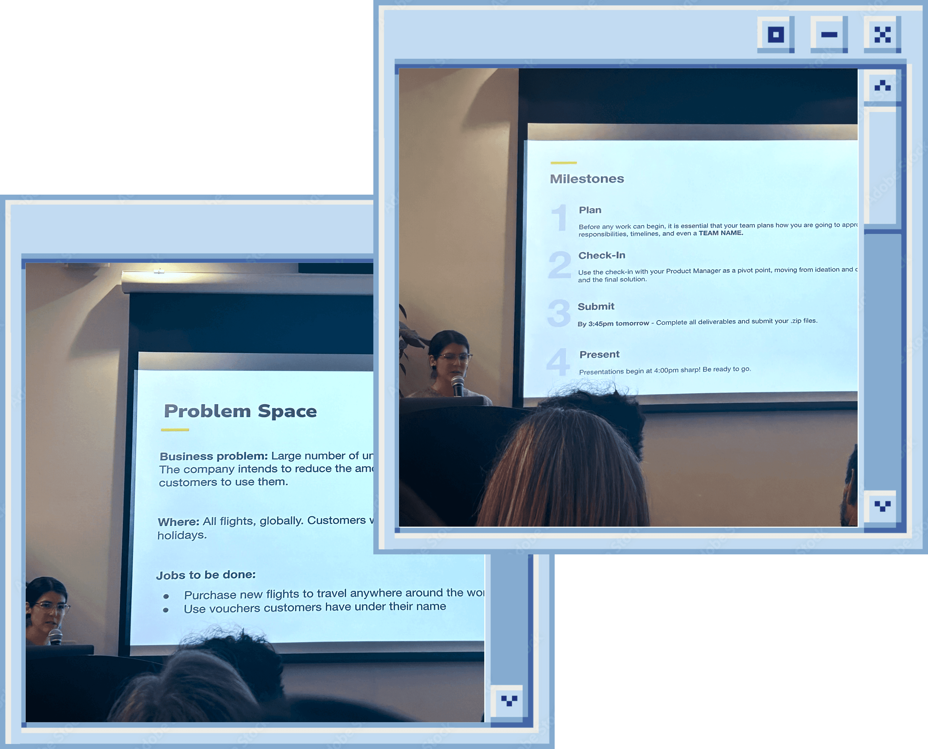
BA team presenting the brief to us

The problem
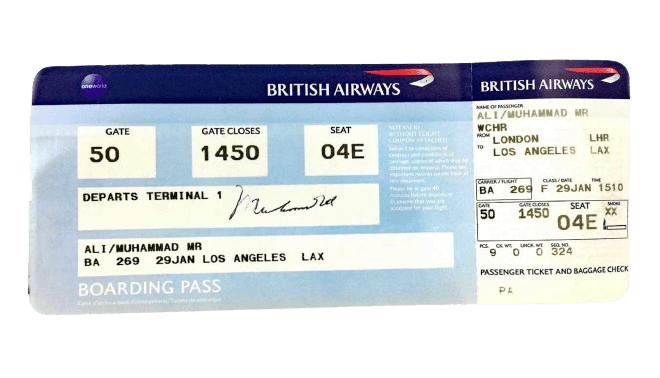
BA customers whose flights or holidays were delayed or cancelled in 2020-21 could exchange their payment for a voucher to use at a later time.
Since 2020, many travel vouchers issued have gone unused. BA is looking to find ways to encourage users to make use of their vouchers because they will all expire in September 2024.
NB: They can purchase new flights to travel anywhere around the world, however travel must be under their name. This applies to all flights, globally. Customers are also not able to redeem vouchers for BA holidays.
The solutions
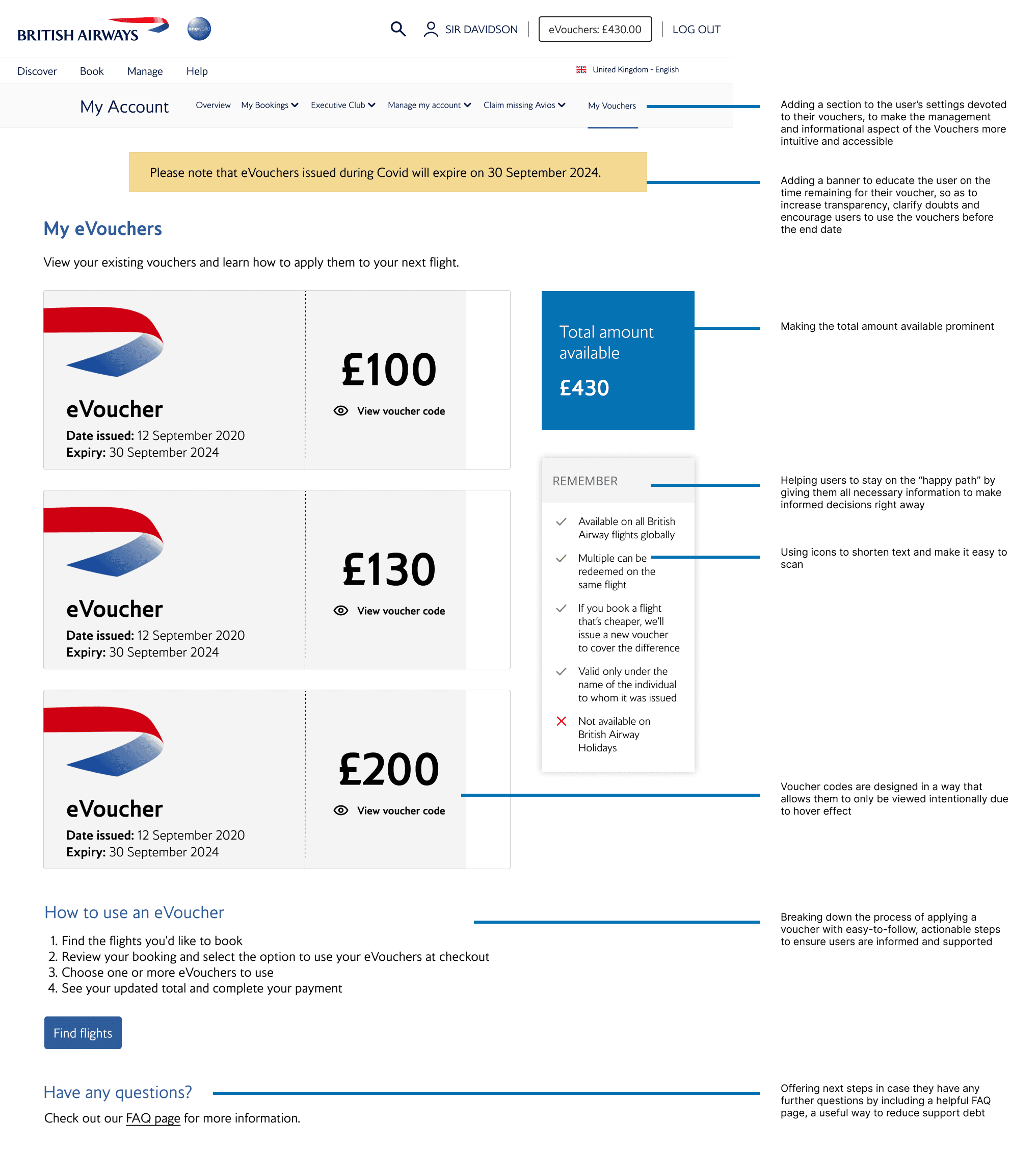
A one-stop shop to view and manage e-Vouchers within the user account system. This way, customers can track and manage their vouchers in real time.
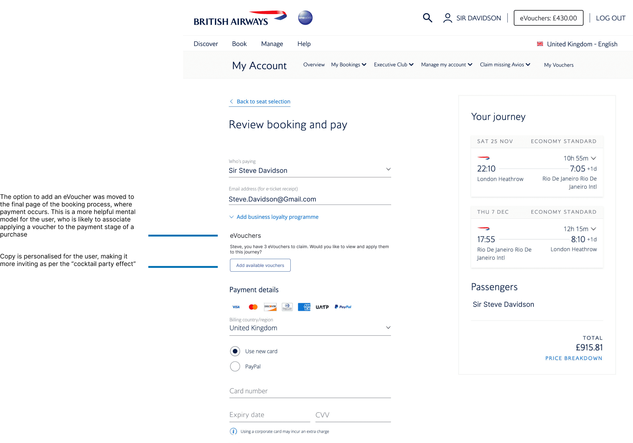
Simplify the process of applying a voucher at the checkout stage, to avoid the possibility for system and user errors.


■ Solutions breakdown
COORDINATE
Discover and learn
Underline tabs separate "hives" from "places," allowing users to also conveniently find places to work from outside of the home
Community-based reviews are a way to rate the quality of a place from a remote worker perspective, helping users make informed decisions and reduce unpredictability when working remotely outside of the home
Map view provides perspective on location and distance
Icons enable user to quickly understand the key amenities available in each place
COORDINATE
Apply and fly
Underline tabs separate "hives" from "places," allowing users to also conveniently find places to work from outside of the home
Community-based reviews are a way to rate the quality of a place from a remote worker perspective, helping users make informed decisions and reduce unpredictability when working remotely outside of the home
Map view provides perspective on location and distance
Icons enable user to quickly understand the key amenities available in each place
■ Design process
Discover
Research
Assumptions
Interviews
Affinity map
Key themes
Define
Persona
Experience map
User stories
Competitor analysis
Guiding principles
Develop
Task flow
Sketches
Wireframes
User testing
Brand development
UI library

Deliver
High fidelity
Marketing website
Discover
CHECKING ASSUMPTIONS
Catching ourselves in the act
In a hackathon setting where time is limited, it's crucial to strategically plan the research phase to ensure that assumptions are validated efficiently without delaying progress. I guided the team to check our assumptions before and after the research stage. The following assumptions were validated with research:
Lack of awareness
Users are unaware that they have an unused voucher
Usability issues
Users struggle to apply the voucher to their purchase
Not needed now
Users do not have the current need to travel
Preference
Users may not like flying with BA or to BA-partnered airports
BRAINSTORMING
Flying through the world of E-vouchers
Setting ourselves up for the upcoming 24 hours, most of the team was unfamiliar with the UX Design process. I made sure to underline the importance of having a firm grasp on the problem space before beginning to draft any type of solution. I also emphasised that the best idea can come from any person with any background (technical and non-technical), and encouraged team members to be vocal and think critically.
We started with a 30 minute timed brainstorming session as a group, following the "Popcorn" discussion style. We highlighted key wording in the brief and potential angles that could be explored in our research. Due to time constraints, we divided research between eight of us to cover as much ground as possible.
Brainstorming
SECONDARY RESEARCH
Looking at the numbers
21%
of airline customers who tried to use their voucher were unable to (Research by Consumer Group Choice)
44%
of people who were able to use vouchers, had to pay more than the original cost of their flight
PRIMARY RESEARCH
Interviewing BA customers
Lorem ipsum
Criteria: Aged 21+; has an active 2019-20 BA e-voucher; immediately available for 15 minutes.
Our mutual contacts combined gave us access to just 1 person who met the above criteria. I devised a quick set of open-ended questions and was responsible for carrying out the interview via voice call.
PRIMARY RESEARCH
Reading up on public opinion
A quick pulse test
Due to time constraints, we also did a deep-dive into public forums, like Reddit's BA community (/rBritishAirways). This was a useful, quick way to get a sense of user specific feedback on their experience with their e-vouchers.
PRODUCT RESEARCH
Exploring the existing product landscape
KEY RESEARCH FINDINGS AND OPPORTUNITIES
Landing on the issues
Losing track of vouchers
Currently, the opportunity to check information about existing vouchers occurs through a portal that is tricky to find and that operates entirely via email. Users find this frustrating and hard to navigate.
Creating a single, highly accessible space to view, manage and apply vouchers within the user's profile.
Difficulty with voucher application
Users have difficulty with the system verification and application of their voucher in the booking process itself, whereby the code does not work as expected. This is to the damaging extent that it is perceived as a dark pattern. This negatively affects company reputation in a critical moment when the airline is already seeking reconciliation from the dissatisfaction of cancellation.
Finding ways to automate the process of applying a voucher to the booking. As well as improving the user experience, this will also reduce support debt and therefore save the company money.
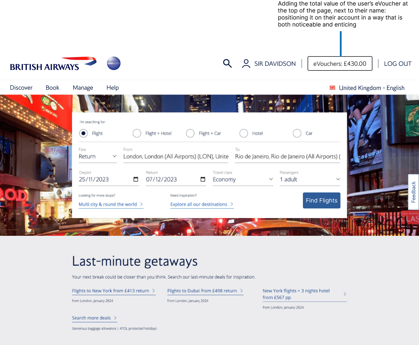
Lack of awareness
Users are unaware of the existence of their voucher. Due to the absence of a marketing budget — and collaboration from a marketing team — constraints meant that we needed to build ways within the product itself for users to be reminded and encouraged to apply their vouchers before their end date.
Developing ways to visually remind and encourage them to learn more about their existing vouchers and apply them.
How might we encourage customers to book flights using their travel voucher?
Define
USER PERSONA
Say hello to Steve

FRUSTRATIONS
Life has picked up again after Covid and he has a busy schedule; Steve struggles to keep track of life admin and is forgetful about existing vouchers
Is frustrated because he has tried to apply Covid vouchers to bookings but has encountered error messages
Finds the process of locating the vouchers, buried in his emails, to be annoying
Does not know where to find the most updated information about his personal vouchers
MOTIVATIONS
Fly in the most convenient way
On the look out for discounted/cheaper flights
Wants to remember to use up flight vouchers before expiry
BEHAVIOURS
Has tried applying the voucher during the booking processes a few times but has encountered error message and code has not worked
Contacted support in frustration, giving up as has not had enough time to dedicate to resolving the issue
EXPERIENCE MAPPING
What does Steve's day look like?
I explained to the group the significance of experience mapping as a way to best identify possibilities to intervene with a digital solution. We brainstormed as a group, and starred potential places where intervention would be most impactful and appreciated.
GOAL SETTING
What is Steve missing?
Recognizing the project's confined scope, we prioritised finding ways to integrate solutions within the existing structure of the product. We set goals for the remainder of the sprint. We aimed to make the process:
Simpler
Reduce the time and steps needed to apply a voucher, including the need to switch repeatedly between different platforms like the BA website, a user's email account and their BA account when dealing with vouchers.
Less stressful
Eliminate the need to contact support by finding ways to guarantee a high success-rate when applying a voucher code.
More intuitive
Improve navigation in a way that favours the discovery and application of the voucher and voucher credit.
Develop
EXPLORATORY SKETCHES
Putting the plan into action
At this stage, the location where the hackathon was being hosted closed and we moved to a hotel lounge to continue with next steps.
Despite the informal setting, we stayed focused. I explained and led different design exercises, like the Crazy 8 process, to encourage everyone to be involved in drafting a potential solution. We did a "Round-the-table" discussion, sharing potential features and design changes.
We chose to explore a solution in desktop view as research by Stravito found that it is currently still the preferred device for air travel bookings.

Working from Hart Hotel in Shoreditch
IDEAS WE CONSIDERED THEN SCRAPPED OR KEPT
Breaking down our design thinking
Countdown timer
Adding a countdown timer in the settings of an active voucher connected to the account, as a way to incentivise users to book.
It was an interesting concept that the software engineers had begun to research and code for, however this was scrapped last minute. We concluded that countdown timers are more of a front-facing marketing feature rather than something to be found in a user's settings.
Safety first
An acknowledgement that vouchers are a currency.
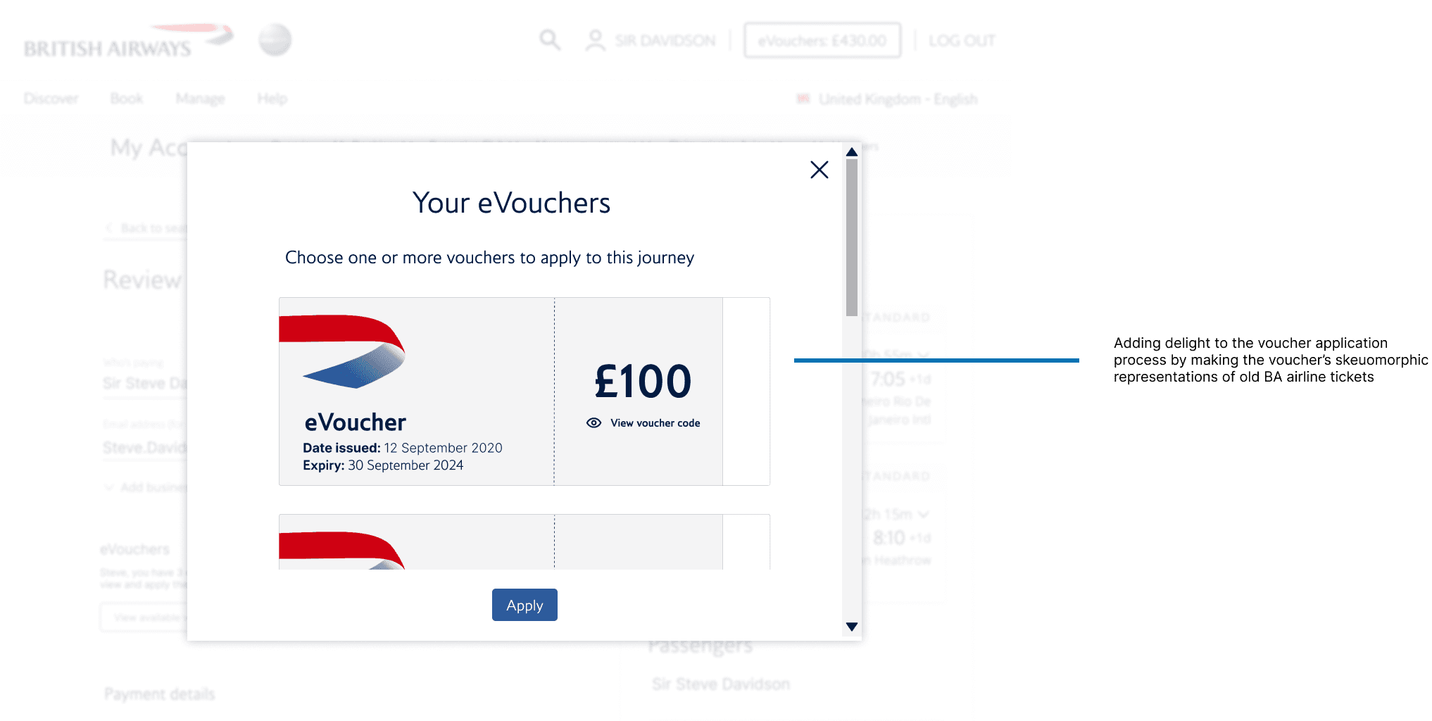
As vouchers are connected to monetary value, we designed a hover feature. In this way, the voucher code can only be viewed safely and intentionally by the user, as a preventative measure.
Honouring brand history
An homage to a premium airline that prides itself on being a 100 year company.
We chose to honour BA's history by drawing inspiration from old BA airline tickets. The vouchers take on the skeuomorphic design and shape of a traditional BA ticket. The hover effect brings to mind a flight attendant tearing a ticket.

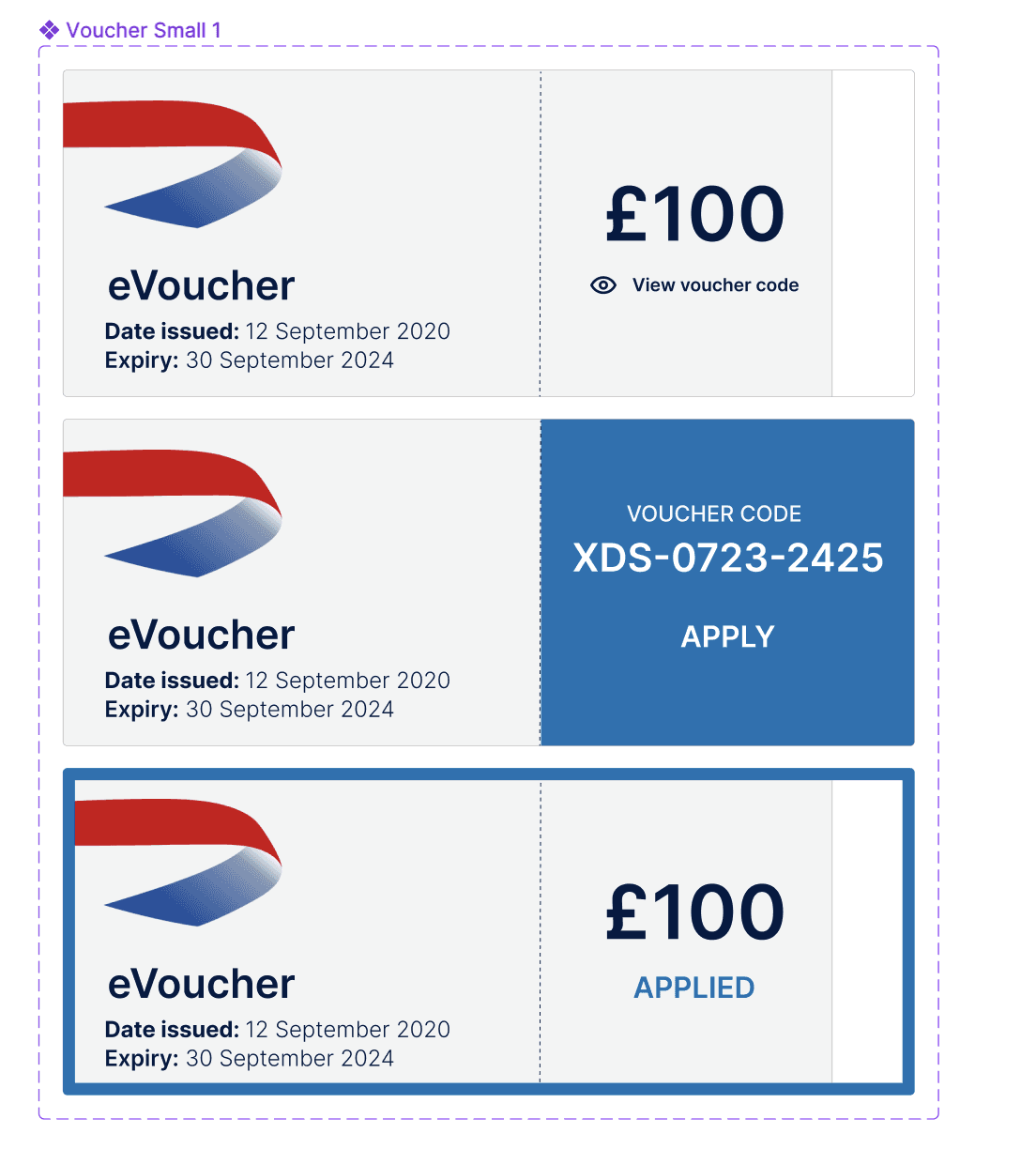
Default
Hover
Applied
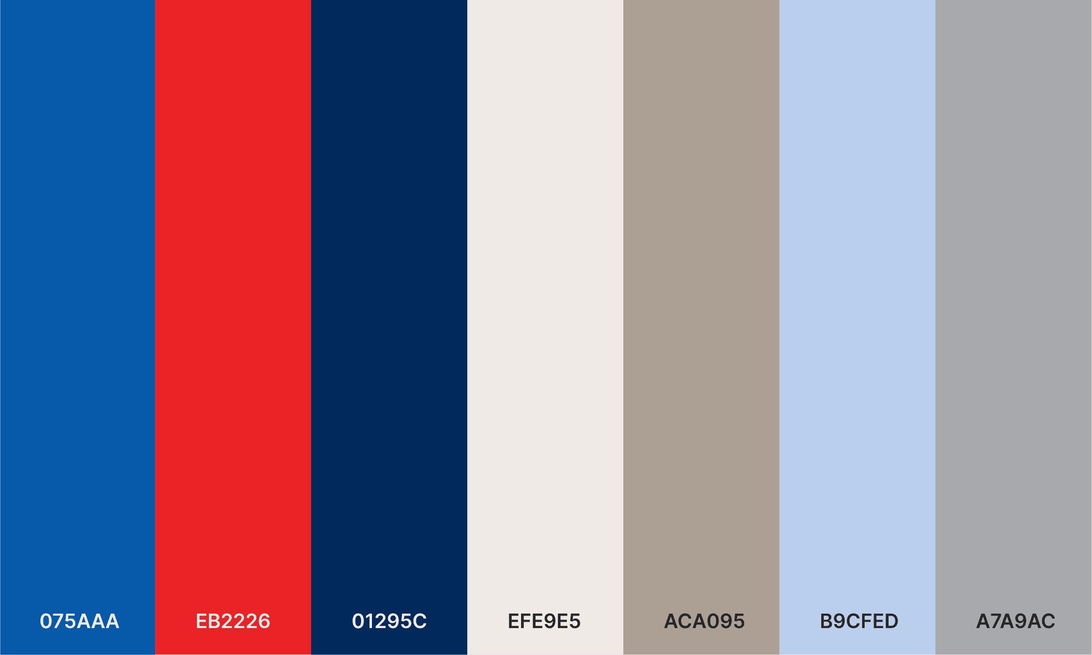
BRANDING COLOURS AND TYPOGRAPHY
The colours of the sky
DEVELOPMENT
Birds of a feather flock together


Deliver
Connecting with consumers
Leveraging data
Understand
ML solution to cluster costumers
Train predictive model with data of people who used vouchers
Connect
Empower marketing to tailor marketing
Personalised experience
Measure
A/B Testing - measure impact of design changes
Measure engagement

EXERPT OF DATA'S INPUT FROM PRESENTATION
Data science excerpts
■ Conclusion
PRESENTING THE PROJECT
Introducing our solution
I had the pleasure of presenting our solution to 5 BA panelists. Alongside the Software Engineering Lead and the Data Science Lead, we made a convincing case around the nature of the problem space identified and our proposed soltuions.


Representing the team and explaining our design thinking
NEXT STEPS
Paving the path for future fliers
Test prototype. Implementing guerrilla testing methods, gathering feedback in public places like cafés, networking events, or libraries, would be an exciting next step.
Build MVP. After various phases of iteration, the design team at Hive would partner with an engineering and data scientist team to develop a basic MVP.
Test MVP. Testing the MVP's success in a small user pool, such as within a small company or existing social media groups for remote workers that are open to experimentation, would be ideal.
Launch BETA. Launching a BETA version in the App Store, next steps would including monitoring downloads, establishing and tracking Task Success Metrics, and using the System Usability Scale tool to inform design decisions.
SWEET REFLECTIONS
