Healthily
Optimising healthcare services through AI
Winning a 72-hour, in person, AI hackathon with a redesign of the symptom checking experience for users, with an empathy-first approach.
British Airways
Building incentives to boook
Simplifying BA user settings and booking flow to make the management of e-Vouchers more useful, intuitive and delightful
■ Overview
Duration
24 hours
My role

Team lead, UX designer
Team

2 Data Scientists
4 Software Engineers
2 UX Designers
Tools

Figma, Photoshop
Duration
24 hours
Tools
Figma, Photoshop
My role
Team lead,
UX Designer
Team
2 Data Scientists
4 Software Engineers
2 UX Designers
Design Challenge
Collaborating with British Airways (BA), our team of 8 was tasked to come up with a solution to a problem that they are currently experiencing with e-Vouchers. I led a team of software engineers, data scientists and UX designers during an intensive 24 hour hackathon, cross-collaborating to get to the root of the problem and come up with a fully functional, well-crafted solution.
Presenting our final solution to BA
The problem
BA customers whose flights or holidays were delayed or cancelled in 2020-21 could exchange their payment for a voucher to use at a later time.
Since 2020, many travel vouchers issued have gone unused. BA is looking to find ways to encourage users to make use of their vouchers because they will all expire in September 2024.
NB: They can purchase new flights to travel anywhere around the world, however travel must be under their name. This applies to all flights, globally. Customers are also not able to redeem vouchers for BA holidays.

The solutions
Redesigning the BA header to bring attention to —and remind users of — the presence of eVouchers.
Originating a one-stop shop to view and manage e-Vouchers within the user account settings. This way, customers can track, manage and learn about their vouchers in real time.
Repositioning and automating the process of applying a voucher at the checkout stage, to avoid the possibility for system and user errors.
Duration
72 hours
Tools
Figma, Dribbble, Mobbin, Loom
My role
Team Lead, UX/UI Designer, Branding
Team
Sole UX/UI designer
1 Business strategist
Design Challenge
As part of an AI and Blockchain hackathon hosted by Encode, our team was tasked to come up with a solution to a healthcare problem faced by the Healthily platform.
Working closely with doctors, medical experts and software engineers, Healthily has developed a Symptom Checker algorithm that is 93% accurate in identifying potential health issues and recommending next steps. This AI is designed to redirect inaccurate streams of users within the patient and healthcare pipeline, based on their symptoms and the services they need.
Our thorough evaluation of the problem space and product landscape, coupled with a design-driven, no-code solution created in just 72 hours, secured us the victory.
Presenting our winning solution

Design Challenge
Collaborating with British Airways (BA), our team of 8 was tasked to come up with a solution to a problem that they are currently experiencing with e-Vouchers. I led a team of software engineers, data scientists and UX designers during an intensive 24 hour hackathon, cross-collaborating to get to the root of the problem and come up with a fully functional, well-crafted solution.
Presenting our final solution to BA
The problem
BA customers whose flights or holidays were delayed or cancelled in 2020-21 could exchange their payment for a voucher to use at a later time.
Since 2020, many travel vouchers issued have gone unused. BA is looking to find ways to encourage users to make use of their vouchers because they will all expire in September 2024.
NB: They can purchase new flights to travel anywhere around the world, however travel must be under their name. This applies to all flights, globally. Customers are also not able to redeem vouchers for BA holidays.
The solutions
Redesigning the BA header to give attention to —and remind users of — the presence of eVouchers.
Originating a one-stop shop to view and manage e-Vouchers within the user account settings. This way, customers can track, manage and learn about their vouchers in real time.
Repositioning and automating the process of applying a voucher at the checkout stage, to avoid the possibility for system and user errors.
What is Healthily?
Healthily is a mobile app that helps user track their habits and develop self-care practices. It is the world’s first medically approved self-care platform.
It is currently pivoting with the release of a second product, an AI Symptom Checker.
What is Encode?
An international community of devs, innovators and tech enthusiasts. Their mission is to help people achieve their personal and professional goals together in web3 by organising high-quality programmes including hackathons.
The problem
Users and healthcare providers are frustrated. Patients are unclear about which services they should use. A total of 60% of insured people are unclear of which services they should use: 30% of patients using telemedicine services are doing so when they can be treated with self-care; meanwhile 30% of patients should have sought a face-to-face appointment instead. Note that any LLM use cannot triage or provide guidance on treatment itself.
The solutions
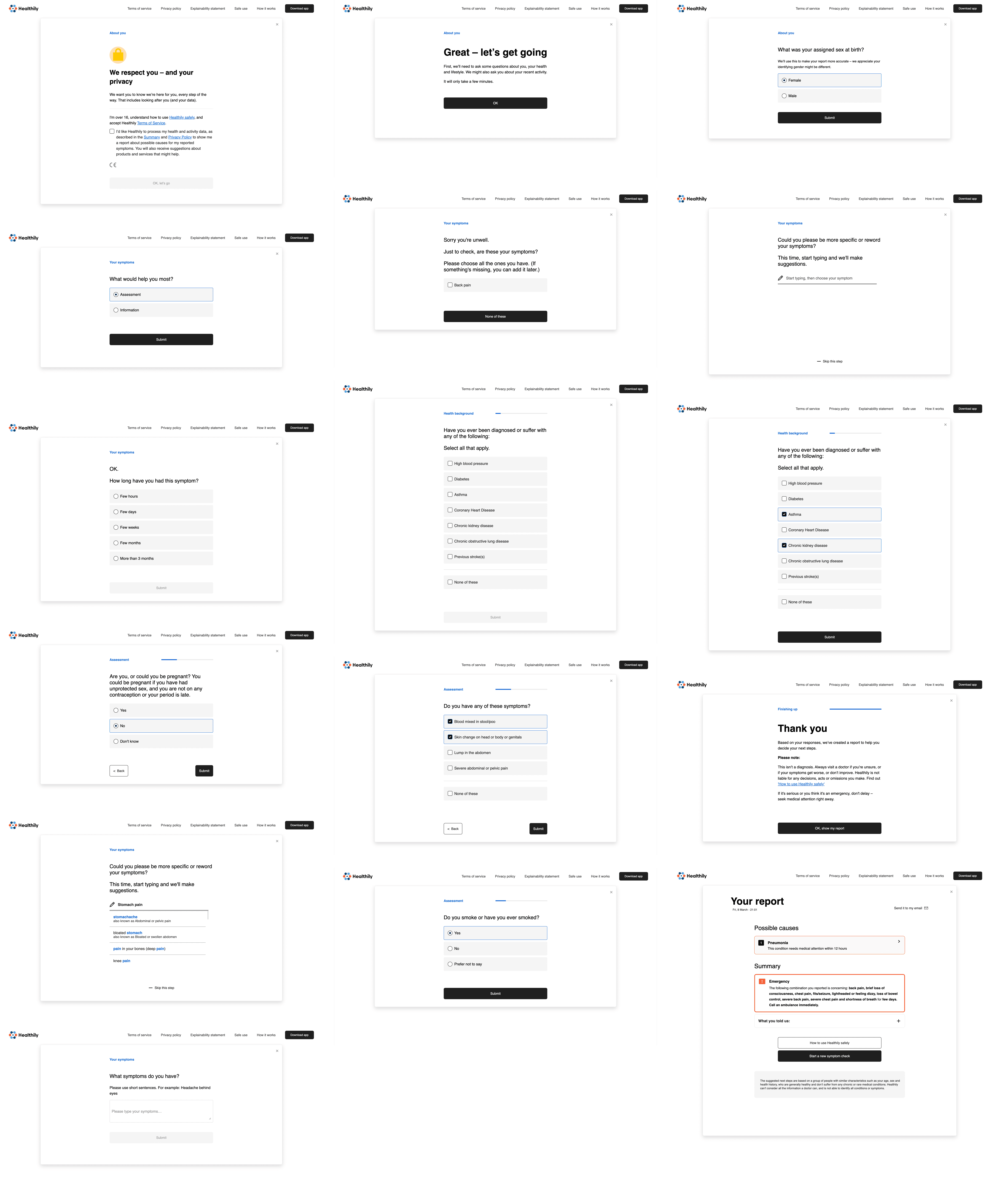
Lily is a personal Health Detective. With Lily, users can check their symptoms and be informed of potential causes and advised on next steps. As a “detective,” Lily is an AI that does not diagnose, rather works alongside the user as an empathic figure to get to their bottom of their symptoms and understand their next steps.
Constraints

Financial
Financial
Financial
No budget to invest in marketing campaigns
No budget to invest in marketing campaigns
No budget to invest in marketing campaigns

Time
Time
Time
Limitations on in-depth user research, user testing
Limitations on in-depth user research, user testing
Limitations on in-depth user research, user testing

Technological
Technological
Technological
No software engineering or data team to develop a code-based solution
No software engineering or data team to develop a code-based solution
No software engineering or data team to develop a code-based solution
BRAINSTORMING
Route planning
Setting ourselves up for the upcoming 24 hours, most of the team was unfamiliar with the UX Design process as it was their first time cross-collaborating. I made sure to underline the importance of having a firm grasp on the problem space before beginning to draft any type of solution. I also emphasised that the best idea can come from any person with any background (technical and non-technical/from any discipline), and encouraged team members to be vocal and think critically.
We started with a 30 minute timed brainstorming session as a group, following the "Popcorn" discussion style. We highlighted key wording in the brief and potential angles that could be explored in our research. Due to time constraints, we divided research between eight of us to cover as much ground as possible.
■ Solutions breakdown
PRODUCT MARKETING WEBSITE
Discover
Clear and friendly copy that educates the user on the benefits of the AI in an approachable and welcoming way
Therapeutic colours and rounded shapes make distressed users feel at ease
Social proof (e.g. quotes, mentions in publications and app numbers, etc.) provide a people-centred focus and build trust in the product
ONBOARDING
Learn
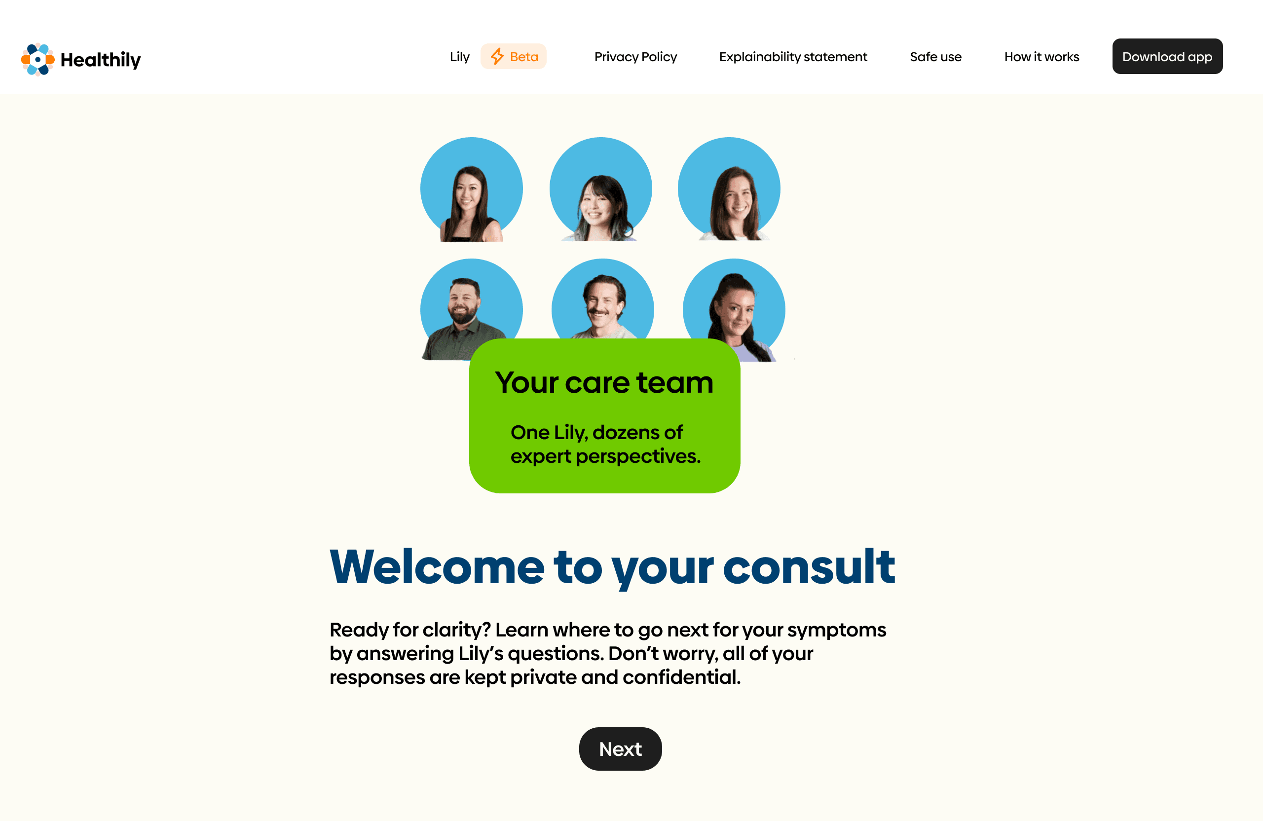
Adding a brief yet informative onboarding process to ensure distressed users have clarity around product usage and expectations
Imagery with eye contact and copy in the third person emphasise human connection
Tiles with annotated images provide quick and easy to digest instructions on product usage
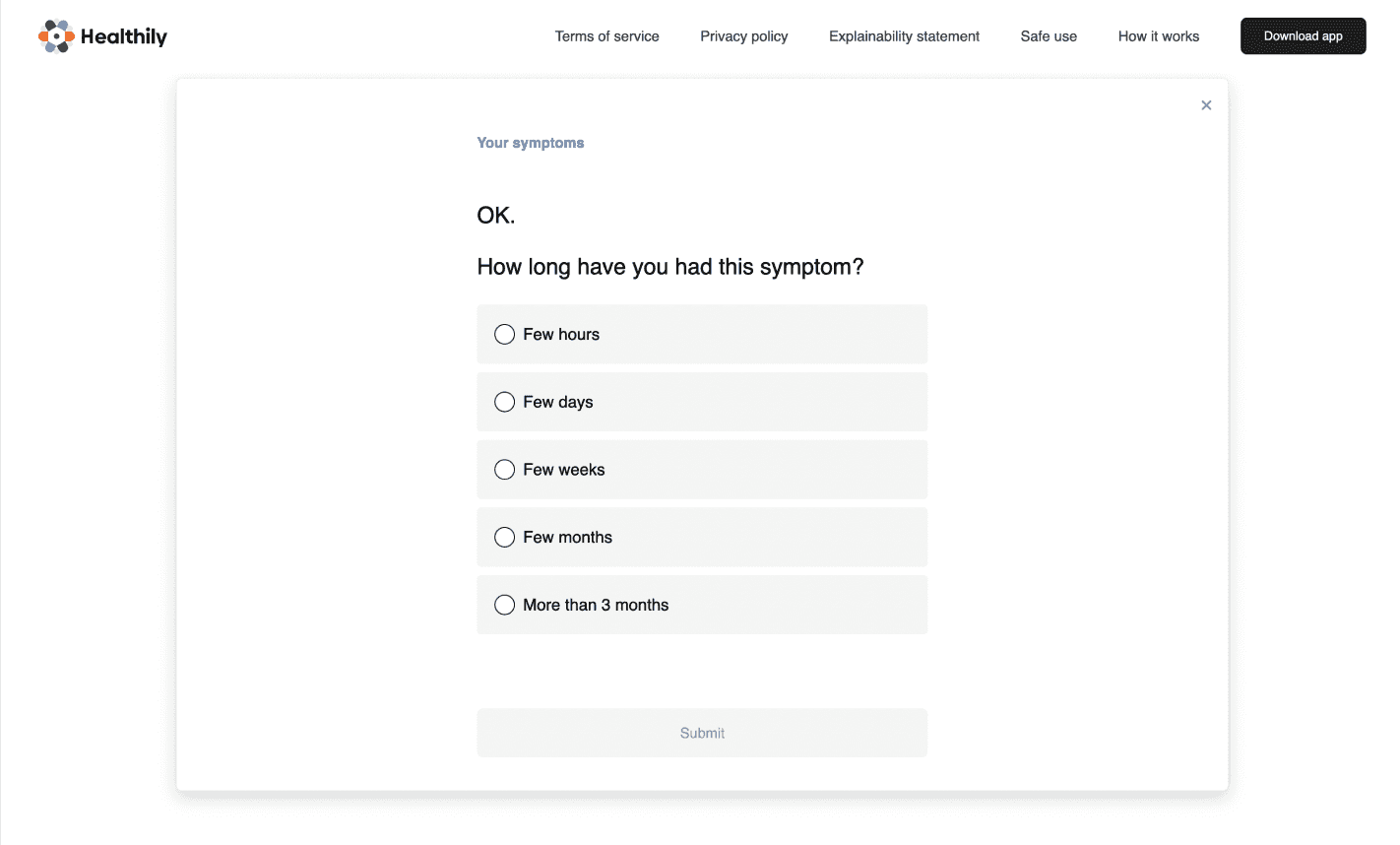
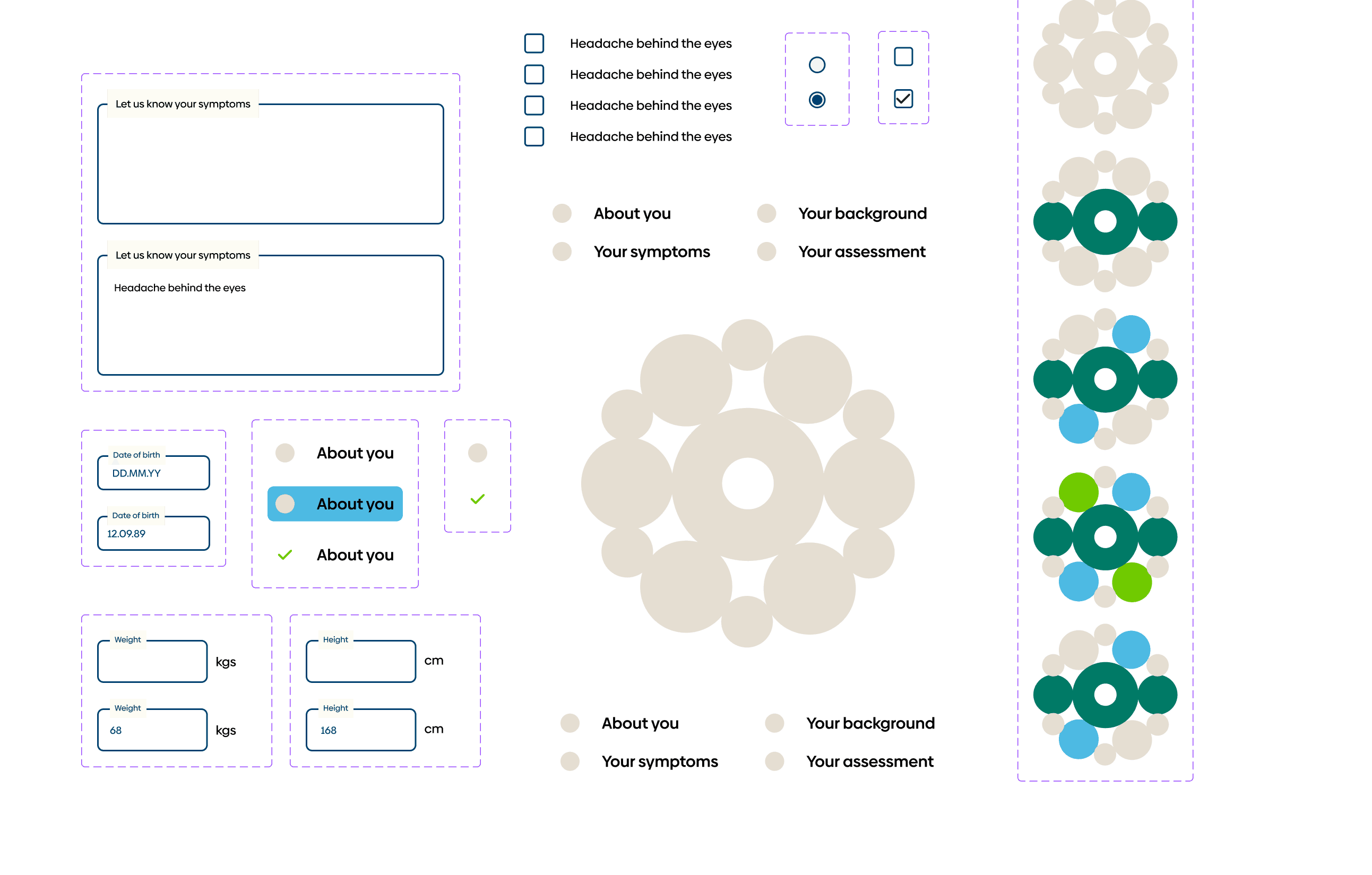
ASSESSMENT AND REPORT
Check-up
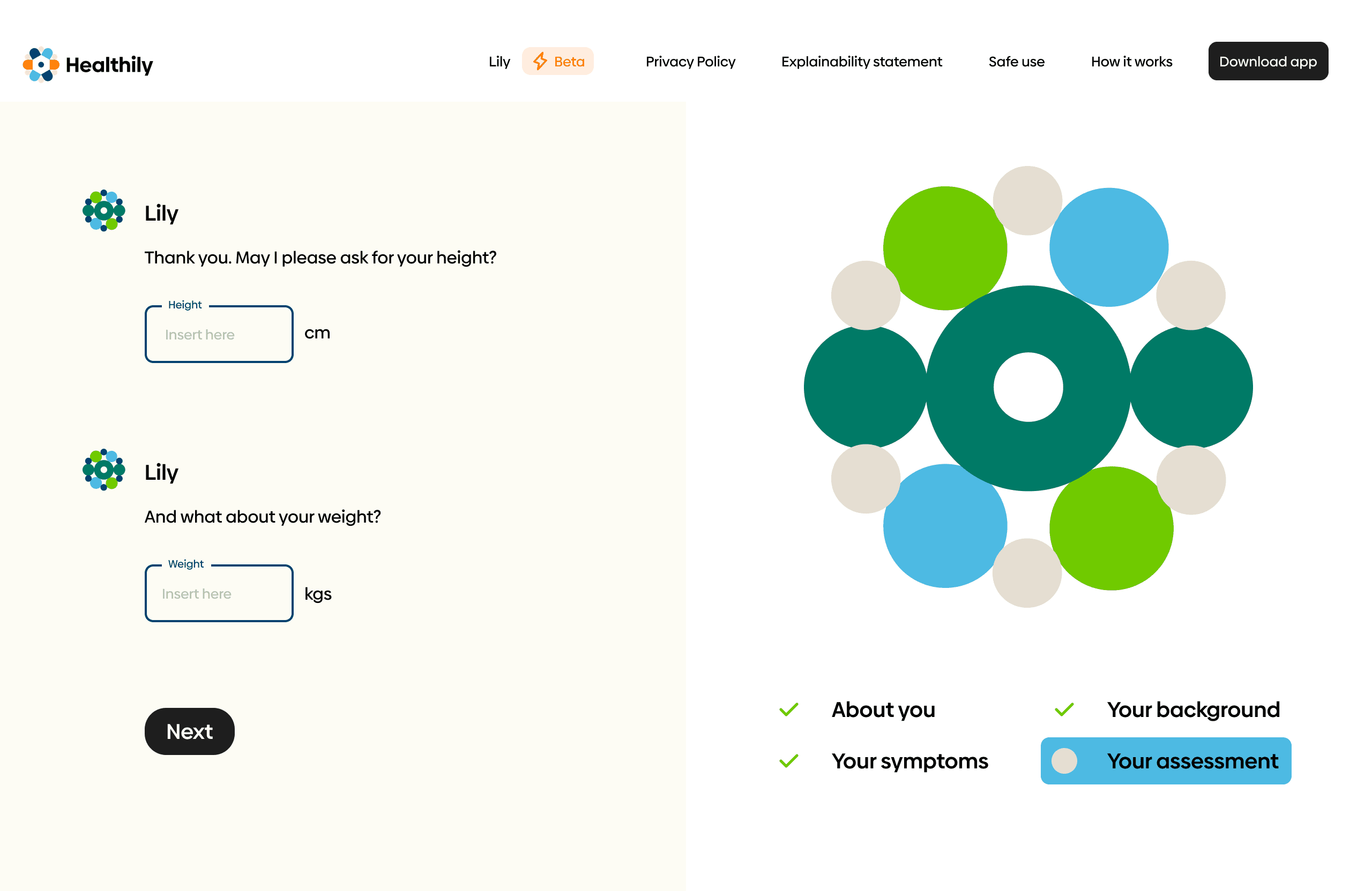
Split screen divides text from dynamic assets that update with suer inputs, providing visual confirmation of AI processing information to reassure the user
Helpful icons provide context to the user about the stage and nature of the assessment, as well as the remaining time to completion
Informational tooltips provide users with additional explanation regarding specific aspects of the assessment process and build reassurance
Skeuomorphic design of the final report gives authority and builds trust in the quality of the assessment
■ Design process
GOAL SETTING
What is Steve missing?
We started with a 30 minute timed brainstorming session as a group, following the "Popcorn" discussion style. We highlighted key wording in the brief and potential angles that could be explored in our research. Due to time constraints, we divided research between eight of us to cover as much ground as possible.
EXPERIENCE MAPPING
Route planning
Setting ourselves up for the upcoming 24 hours, most of the team was unfamiliar with the UX Design process as it was their first time cross-collaborating. I made sure to underline the importance of having a firm grasp on the problem space before beginning to draft any type of solution. I also emphasised that the best idea can come from any person with any background (technical and non-technical/from any discipline), and encouraged team members to be vocal and think critically.
We started with a 30 minute timed brainstorming session as a group, following the "Popcorn" discussion style. We highlighted key wording in the brief and potential angles that could be explored in our research. Due to time constraints, we divided research between eight of us to cover as much ground as possible.
EXPERIENCE MAPPING
What is Steve missing?
Recognizing the project's confined scope, we prioritised finding ways to integrate solutions within the existing structure of the product. We set goals for the remainder of the sprint. We aimed to make the process:
ALIGNING ON THE PATH FORWARD
Building a healthy foundation
We started by identifying an accountability buddy at the hackathon, who took on an informal role of Product Manager. We set out a timeframe for ourselves to make sure we covered the necessary bases in the time available. We tasked our PM to keep us on track, ask us critical questions, as well as be a bouncing board for feedback.
SECONDARY RESEARCH
Assessing assumptions
I guided the group in outlining our assumptions and allocated time to explore the problem space as a team. Due to the time constraints, I decided that it would be useful to explore qualitative secondary research, as a descriptive means to understanding user frustrations and immerse ourselves into the mind of healthcare and telemedicine users.
"Patients within the healthcare space feel unseen and ‘genericised’ instead of as unique human beings with unique health needs…"
"...we all pine for a personal touch, empathy of a healthcare provider who knows our history, “gets us.”
"there is still a fundamental disconnect between my data – be it medical history or even recently received lab results – and the decision-making and context my primary care physician is using when engaging with me for any diagnoses."
Patients don't want
To have a generalised experience
To be left guessing on what to do next when distressed
To be misdiagnosed
Patients want
To be understood and heard
Speed and convenience of service
Reassurance and guidance on next steps
PRODUCT RESEARCH
Pulse check
With an understanding of user expectations when it comes to healthcare services, and certain assumptions validated, we used this context to conduct product research to situate ourselves in their minds. This gave us perspective when evaluating the current symptom checking process that Healthily offers — currently marketed by the company as The Symptom Checker. We evaluated its features, functionalities, user interface, and user experience and identified areas of opportunity and that require further exploration.
Feels lengthy, formal and repetitive, and lacks engaging elements

Absence of empathy and compassion in both look, feel, and tone of voice

Lack of clarity as to what next steps are on the platform, with no clear call to action on the platform
Feels lengthy, formal and repetitive, and lacks engaging elements
Absence of empathy and compassion in both look, feel, and tone of voice
Lack of clarity as to what next steps are on the platform, with no clear call to action on the platform
Feels lengthy, formal and repetitive, and lacks engaging elements
Absence of empathy and compassion in both look, feel, and tone of voice
Lack of clarity as to what next steps are on the platform, with no clear call to action on the platform
Feels lengthy, formal and repetitive, and lacks engaging elements
Absence of empathy and compassion in both look, feel, and tone of voice
Lack of clarity as to what next steps are on the platform, with no clear call to action on the platform
KEY RESEARCH FINDINGS AND OPPORTUNITIES
Landing on the issues
Losing track of vouchers
Currently, the opportunity to check information about existing vouchers occurs through a portal that is tricky to find and that operates solely via email. This means that users need to track their vouchers entirely via email and the responsibility of this falls entirely on the user. This inconveniences users, and they find this frustrating and hard to navigate.
Creating a highly accessible space to view, manage and apply vouchers within the user's profile and in the booking flow.
Difficulty with voucher application
Users have difficulty with the system verification and application of their voucher in the booking process itself, whereby the code does not work as expected. This is to the damaging extent that it is perceived as a dark pattern. This negatively affects company reputation in a critical moment when the airline is already seeking reconciliation and has an apologetic stance.
Finding ways to automate the process of applying a voucher to the booking. As well as improving the user experience, this will also reduce support debt and therefore save the company money.
Lack of awareness
Users are unaware of the existence of their voucher. Due to the absence of a marketing budget — and collaboration from a marketing team — constraints meant that we needed to build ways within the product itself for users to be reminded and encouraged to apply their vouchers before their end date.
Developing ways to visually remind and encourage users to learn more about their existing vouchers and apply them.
How might we encourage customers to book flights using their travel voucher?
KEY FINDINGS AND OPPORTUNITIES
Landing on
the issues
Less stressful
Eliminate the need to contact support by finding ways to guarantee a high success-rate when applying a voucher code.
More intuitive
Improve navigation in a way that favours the discovery and application of the voucher and voucher credit.
Simpler
Reduce the time and steps needed to apply a voucher, including the need to switch repeatedly between different platforms like the BA website, a user's email account and their BA account when dealing with vouchers.
Difficulty with voucher application
Users have difficulty with the system verification and application of their voucher in the booking process itself, whereby the code does not work as expected. This is to the damaging extent that it is perceived as a dark pattern. This negatively affects company reputation in a critical moment when the airline is already seeking reconciliation and has an apologetic stance.
Finding ways to automate the process of applying a voucher to the booking. As well as improving the user experience, this will also reduce support debt and therefore save the company money.
Lack of awareness
Users are unaware of the existence of their voucher. Due to the absence of a marketing budget — and collaboration from a marketing team — constraints meant that we needed to build ways within the product itself for users to be reminded and encouraged to apply their vouchers before their end date.
Developing ways to visually remind and encourage users to learn more about their existing vouchers and apply them.
Losing track of vouchers
Currently, the opportunity to check information about existing vouchers occurs through a portal that is tricky to find and that operates solely via email. This means that users need to track their vouchers entirely via email and the responsibility of this falls entirely on the user. This inconveniences users, and they find this frustrating and hard to navigate.
Creating a highly accessible space to view, manage and apply vouchers within the user's profile and in the booking flow
How might we encourage customers to book flights using their travel voucher?
Simpler
Reduce the time and steps needed to apply a voucher, including the need to switch repeatedly between different platforms like the BA website, a user's email account and their BA account when dealing with vouchers.
Less stressful
Eliminate the need to contact support by finding ways to guarantee a high success-rate when applying a voucher code.
More intuitive
Improve navigation in a way that favours the discovery and application of the voucher and voucher credit.
KEY FINDINGS AND OPPORTUNITIES
Healing the open wound
Expanding empathy
The integration of AI should not compromise essential human qualities like empathy that patients seek in their interactions with healthcare professionals.
Currently, the platform's solution lacks human elements of understanding and compassion: both throughout the symptom checking process, in the tone, as well as in it's look and feel of a glamorised form, as well as in the branding of the product itself, which feels very impersonal and distant.
Opportunity: develop more touchpoints for compassion on the platform and throughout the user experience.
Fostering trust
Patients have a perceived uniqueness of their health needs. This means they feel that AI may not adequately address their individual health requirements, leading to doubts about the technology's ability to cater to their specific needs.
As of now, the product feels very impersonal, with little confirmation and recognition of the users sentiments until the diagnosis at the end.
Opportunity: improve trust between the user and platform, through a more personalised experience.
How might we support patients to access the correct healthcare channels?
PROTO-PERSONA
Angelita's journey
A Healthily user who self-identifies as a hypochondriac
Often worried and anxious about her health
Seeks reassurance from friends, family and healthcare professionals
Looking for quick answers to her health concerns
Has been misdirected by healthcare providers in the past

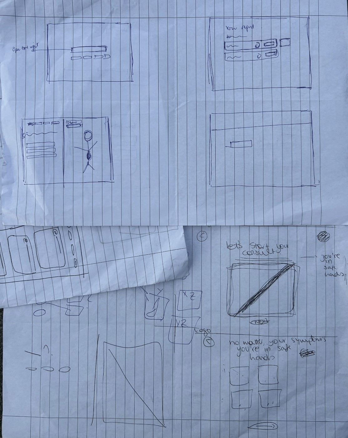
EXPLORATORY SKETCHES AND SOLUTIONS
Cooking up ideas
With an understanding of user needs, I led and explained ideation exercises like Crazy 8s to guide our thinking process as a team. My teammate came from a business strategy background and was unfamiliar with ideation exercises. I explained the benefits of involvements from all teammates and emphasised that ideas from both a technical and non-technical background are equally valuable in this stage of the design process.
SPOTLIGHT ONE
Making the user feel heard
What are ways in which we can make the user feel heard, when inputting data? How can machine learning validate how users feel? We explored ways in which we can design for users seeking "reassurance."
Simpler
Reduce the time and steps needed to apply a voucher, including the need to switch repeatedly between different platforms like the BA website, a user's email account and their BA account when dealing with vouchers.
Less stressful
Eliminate the need to contact support by finding ways to guarantee a high success-rate when applying a voucher code.
More intuitive
Improve navigation in a way that favours the discovery and application of the voucher and voucher credit.
Designing for visual confirmation
Tasked with designing for desktop, we decided to split the screen and use the right-hand side as way to give visual confirmation to the user that the AI is processing their input.
Using visuals throughout the symptom checking process introduces a more user friendly and engaging method that not only makes them feel heard, but also helps with engagement rates.
This visual stimulation would ensure that users pay more attention throughout the process and give more accurate and "thought out" answers, rather than ones that are rushed and distracted.
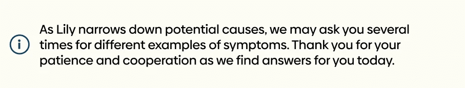
Keeping users on the happy path
About halfway through the symptom checking process, questions begin getting very repetitive and similar in nature, as the algorithm begins narrowing down potential health causes. With no context for the user, this can feel unusual and give them a sense that something is "wrong," or worse — that the product and algorithm is not working.
We explored ways in which the user interface could be designed to give preemptive context to the user, so as to reduce feelings of distrust towards the platform.
Introducing more human touches
The current marketing of the product, onboarding screens as well as process on the whole is very text heavy, and is missing an opportunity to introduce reassurance through the human gaze.
Studies show that there is a higher engagement with a product when the fourth wall is broken with a user. To ensure the user does not feel alone, we searched for more positive and affirming imagery with people looking at the user directly to make them feel supported and heard.
To help them understand that the AI is not a soulless creation but one that represents the work of many people whose best interest is to make their lives better.
SPOTLIGHT TWO
Reimagining the product identity
We did a deep dive of the current Healthily app and noticed the notion of being your own "health detective."
Notably, current product branding of AI positions LLM's as an "assistant" on the user's journey: for example, Shopify's Sidekick (a partner in your e-commerce adventures), Microsoft's Co-Pilot (a partner that helps you navigate life and work), or Google's Gemini which is Latin for "twin."

Onboarding screens on Healthily mobile app
Simpler
Reduce the time and steps needed to apply a voucher, including the need to switch repeatedly between different platforms like the BA website, a user's email account and their BA account when dealing with vouchers.
Less stressful
Eliminate the need to contact support by finding ways to guarantee a high success-rate when applying a voucher code.
More intuitive
Improve navigation in a way that favours the discovery and application of the voucher and voucher credit.
Defining the role of the product
While the current name of the product is Symptom Checker, we chose to repurpose and expand on the concept of "Health Detective:"
Assistant on health discoveries (not quite a "medical" expert but an expert nonetheless)
A relatable, friendly figure, who is playing on the same "team" as the user
Educated, driven and dedicated to the user's cause
Colours and tones
Studies show that green has a therapeutic and calming effect on the mind. I recognise that that users like Angelita are likely to be frustrated, distressed, agitated or at least worried about their wellbeing when navigating the application.
Using the company branding documents that I sourced on Dribbble, I decided to explore different combinations of the company's pre-approved shades of green.
Shapes
When picking the Health Detective's logo, I identified secondary logos that the company has designed but seldom uses.
I decided to opt for one of these pre-approved logos as the Health Detective’s identifying shape. With semblance in look and feel to OpenAI’s ChatGPT or Perplexity's AI, it is a nod to the notion of being "generative."
The repetitive circular shapes feel both comforting and structured, as well as exponential in possibilities.

Simpler
Reduce the time and steps needed to apply a voucher, including the need to switch repeatedly between different platforms like the BA website, a user's email account and their BA account when dealing with vouchers.
Less stressful
Eliminate the need to contact support by finding ways to guarantee a high success-rate when applying a voucher code.
More intuitive
Improve navigation in a way that favours the discovery and application of the voucher and voucher credit.
DESIGN AND DEVELOPMENT
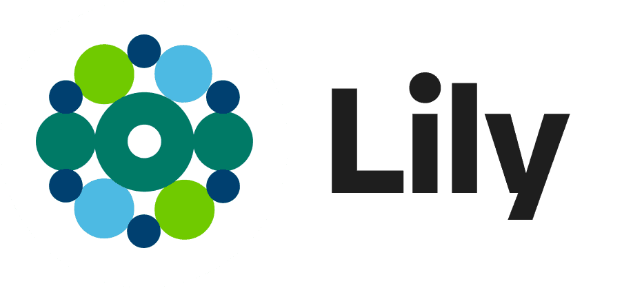
Say hello to Lily
Softens the slightly harder, more masculine and intense connotations of "detective"
Approachable and on-brand name that rolls off the tongue: Lily by Healthily
Alludes to a “lily pad,” which ties into the shapes of the logo and gives a natural, healthy and relaxing feel
DESIGN CRITIQUE
Handover
I designed our solution in greyscale. After a design critique from the team (in the form of Popcorn discussion), it was edited a final time before being developed in high fidelity. We relied on prototyping the solution to showcase our solution to the judges.
EXPLORATORY SKETCHES
Putting the plan into action
At this stage, the location where the hackathon was being hosted closed and we moved to a hotel lounge to continue with next steps.
Despite the informal setting, we stayed focused. I explained and led different design exercises, like the Crazy 8 process, to encourage everyone to be involved in drafting a potential solution. We did a "Round-the-table" discussion, sharing potential features and design changes.
We chose to explore a solution in desktop view as research by Stravito found that it is currently still the preferred device for air travel bookings.
FINAL VERSIONS
Handing over to the developers
Recognizing the project's confined scope, we prioritised finding ways to integrate solutions within the existing structure of the product. We set goals for the remainder of the sprint. We aimed to make the process:
EXPLORATORY SKETCHES
Putting the plan into action
At this stage, the location where the hackathon was being hosted closed and we moved to a hotel lounge to continue with next steps.
Despite the informal setting, we stayed focused. I explained and led different design exercises, like the Crazy 8 process, to encourage everyone to be involved in drafting a potential solution. We did a "Round-the-table" discussion, sharing potential features and design changes.
We chose to explore a solution in desktop view as research by Stravito found that it is currently still the preferred device for air travel bookings.
Countdown timer
Adding a countdown timer in the settings of an active voucher connected to the account, as a way to incentivise users to book.
It was an interesting concept that the software engineers had begun to research and code for, however this was scrapped last minute. We concluded that countdown timers are more of a front-facing marketing feature rather than something to be found in a user's settings.

Safety first
An acknowledgement that vouchers are a currency.
As vouchers are connected to monetary value, we designed a hover feature. In this way, the voucher code can only be viewed safely and intentionally by the user, as a preventative measure.

Honouring brand history
An homage to a premium airline that prides itself on being a 100 year company.
We chose to honour BA's history by drawing inspiration from old BA airline tickets. The vouchers take on the skeuomorphic design and shape of a traditional BA ticket. The hover effect brings to mind a flight attendant tearing a ticket.
Safety first
An acknowledgement that vouchers are a currency.
As vouchers are connected to monetary value, we designed a hover feature. In this way, the voucher code can only be viewed safely and intentionally by the user, as a preventative measure.
Honouring brand history
An homage to a premium airline that prides itself on being a 100 year company.
We chose to honour BA's history by drawing inspiration from old BA airline tickets. The vouchers take on the skeuomorphic design and shape of a traditional BA ticket. The hover effect brings to mind a flight attendant tearing a ticket.
Countdown timer
Adding a countdown timer in the settings of an active voucher connected to the account, as a way to incentivise users to book.
It was an interesting concept that the software engineers had begun to research and code for, however this was scrapped last minute. We concluded that countdown timers are more of a front-facing marketing feature rather than something to be found in a user's settings.
USER PERSONA
Say hello to Steve
BRANDING COLOURS AND TYPOGRAPHY
The colours of the sky
We made sure to use branded colours and typography to build a look and feel that aligned smoothly with BA's recent rebrand.
IDEAS WE CONSIDERED, SCRAPPED OR KEPT
Breaking down our design thinking
IDEAS WE CONSIDERED THEN SCRAPPED OR KEPT
Breaking down our design thinking
At this stage, the location where the hackathon was being hosted closed and we moved to a hotel lounge to continue with next steps.
Despite the informal setting, we stayed focused. I explained and led different design exercises, like the Crazy 8 process, to encourage everyone to be involved in drafting a potential solution. We did a "Round-the-table" discussion, sharing potential features and design changes.
We chose to explore a solution in desktop view as research by Stravito found that it is currently still the preferred device for air travel bookings.
NEXT STEPS
Preparing for take-off
Take time to improve the quality of our research, to best align our designs with user needs, by interviewing other users with unused BA vouchers.
Mental model deep-dive. Looking at other user settings across different platforms (including other airline competitors) to cross-reference our UI work. Taking a closer look at the BA branding guidelines to understand how to best align our suggestions even further with the look and feel of the brand.
Several rounds of user testing and usability tests, prioritising feedback to iterate in the most time efficient way possible. Developing the UI further, making our designs responsive and working more closely with grids. Scaling to include these updates in the BA app.
Once launched, collaborate closely with the data team, using methods like A/B testing to best understand the success rate of our designs and where we can improve.
EXCERPTS OF THE DATA TEAM'S INPUT
Leveraging data
The Data Scientists highlighted a few ways data can play an important role here. Of their references, I wish to emphasise A/B testing as a way to verify the success of changes to product features, and lead future iterations. They devised a hypothesis test example:
FINAL VERSIONS
Handing over to the developers
Understand
ML solution to cluster costumers
Train predictive model with data of people who used vouchers
Connect
Empower marketing to tailor marketing
Personalised experience
Measure
A/B Testing - measure impact of design changes
Measure engagement
EXCERPTS OF THE DATA TEAM'S INPUT
Leveraging data
The Data Scientists highlighted a few ways data can play an important role here. Of their references, I wish to emphasise A/B testing as a way to verify the success of changes to product features, and lead future iterations. They devised a hypothesis test example:
Before and after
Website
ORIGINAL

Worrying imagery
Cold colours
Plain language
NEW VERSION

Soothing imagery
Personalised feel
Warm and nurturing tone
Onboarding
ORIGINAL

No onboarding screens
No guidance on what to expect
Feel the lack of support
NEW VERSION

Comforting, supportive, human-focused experience
Recovery-focused imagery and content
Clear expectations set
Assessment
ORIGINAL
Feels like a form/survey that is repetitive and not very engaging
NEW VERSION
More interactive and visual elements around progress and completion, with a supportive, conversational feel
Tone
ORIGINAL
Lack of empathy and compassion in the language and tone
NEW VERSION
Humanised understanding and supportive language around expectations
Report
ORIGINAL
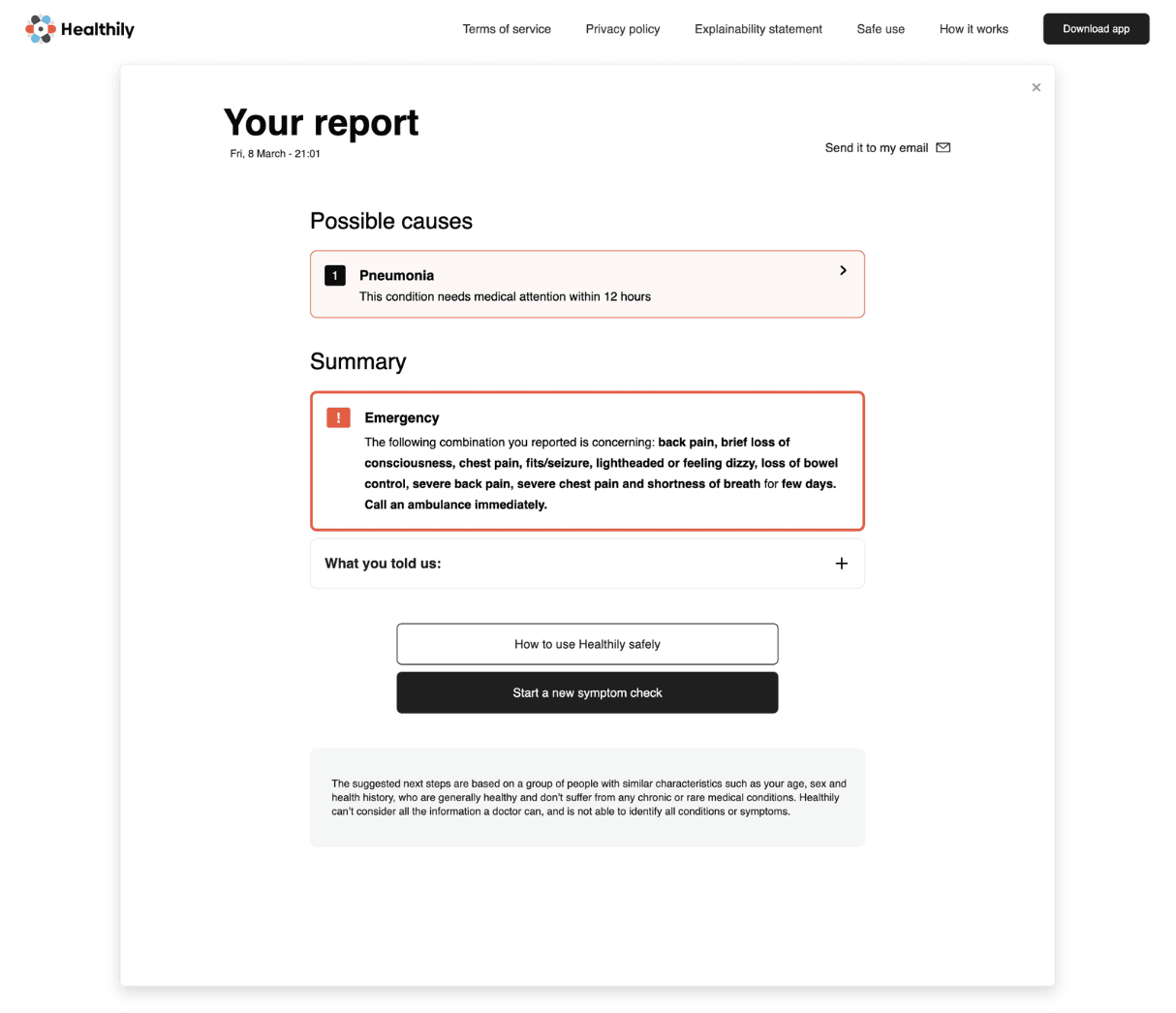
Weak CTA and guidance on next steps
NEW VERSION

Clear platform CTA and guidance
NEXT STEPS
Preparing for
take-off
Take time to improve the quality of our research, to best align our designs with user needs, by interviewing other users with unused BA vouchers.
Mental model deep-dive. Looking at other user settings across different platforms (including other airline competitors) to cross-reference our UI work. Taking a closer look at the BA branding guidelines to understand how to best align our suggestions even further with the look and feel of the brand.
Several rounds of user testing and usability tests, prioritising feedback to iterate in the most time efficient way possible. Developing the UI further, making our designs responsive and working more closely with grids. Scaling to include these updates in the BA app.
Once launched, collaborate closely with the data team, using methods like A/B testing to best understand the success rate of our designs and where we can improve.
It would allow us to assume that our changes made a positive impact. See other examples they discussed below:
Understand
ML solution to cluster costumers
Train predictive model with data of people who used vouchers
Connect
Empower marketing to tailor marketing
Personalised experience
Measure
A/B Testing - measure impact of design changes
Measure engagement
■ Conclusion
PRESENTING THE PROJECT
Handover
I developed a live demo of the Figma prototype and recording the presentation with Loom, for the judges at Encode and Healthily.
I had the pleasure of presenting our solution to 5 BA panelists. Alongside the Software Engineering Lead and the Data Science Lead, we made a convincing case around the nature of the problem space identified and our proposed solutions.
Representing the team and explaining our design thinking
MENTAL NOTES
For my next hackathon…
NEXT STEPS
Preparing for take-off
MENTAL NOTES
For my next hackathon…
Take time to improve the quality of our research, to best align our designs with user needs, by interviewing other users with unused BA vouchers.
Mental model deep-dive. Looking at other user settings across different platforms (including other airline competitors) to cross-reference our UI work. Taking a closer look at the BA branding guidelines to understand how to best align our suggestions even further with the look and feel of the brand.
Several rounds of user testing and usability tests, prioritising feedback to iterate in the most time efficient way possible. Developing the UI further, making our designs responsive and working more closely with grids. Scaling to include these updates in the BA app.
Once launched, collaborate closely with the data team, using methods like A/B testing to best understand the success rate of our designs and where we can improve.
Take time to improve the quality of our research to best align our designs with user needs, by interviewing other users: both existing Healthily users as well as others in the target market.
Consult with a data, software engineering and the Healthily team, gather input on these changes, and whether adjustments or iterations need to be made due to technical needs.
Several rounds of user testing and usability tests, prioritising feedback to iterate in the most time efficient way possible (e.g. developing back or undo buttons in the assessment flow).
Once launched, collaborate closely with the data team, using methods like A/B testing to best understand the success rate of our designs and where we can improve.
REFLECTIONS AND OBSERVATIONS
Prescriptions for my next hackathon
Open communication
My teammate and I were complete strangers at the beginning of the event and became good friends by the end of it. Before starting, it was helpful to outline what our communication styles, as well as our strengths and weaknesses.
About 15 minutes in, he said, "I live by the rule of: do what you say you are going to do." This open exchange at the start allowed us to not only understand each other very early on, but also trust in each other deeply. A 72 hour hackathon can feel very much like doing a trust fall with a stranger. The presence or absence of that chat at the start can make or break a team.
The power of pacing yourself
As other teams rushed into their design solutions, we realised it was a marathon not a sprint very early on. Although it was tempting to fall into the pattern of other teams, we made sure to get a good night's sleep on the first night. When designing without a solution in mind (in the exploratory phase) in such a short time span, it's easy to feel panicked, stay up late and rush into a solution. Avoid burnout by trusting the UX process and spread your energies across the entire 72 hours as evenly as possible. Don't worry, the adrenaline will definitely be enough to keep you awake on the last night!
I did this well!
Make room for error
We left only a few minutes for the final hand-in, and this sleep-deprived rush meant that we didn't hand over the documents with the correct viewing permissions. Luckily, I noticed 30 minutes after the deadline, and we were given permission to resubmit the files. However, other competitions might not be as lenient — leaving room for these final checks is crucial.
Let's reconvene in an hour
The team was very small, and the time was very short. We navigated this by leaving room for quick and impromptu feedback as well as having scheduled time for longer check-ins with each other every 2-3 hours.
This scheduled time was helpful as it allowed us to ask each other questions in bulk rather than ask each other continuously for opinions.
I did this well!
